The mission of CareerVillage is to democratize access to career information. CareerVillage connects students with established professionals providing guidance. There’s currently 2.5 million learners being served and 10,000+ professional volunteers providing guidance to students on the platform.
Design Highlights
Designing formatting tools to improve readership metrics
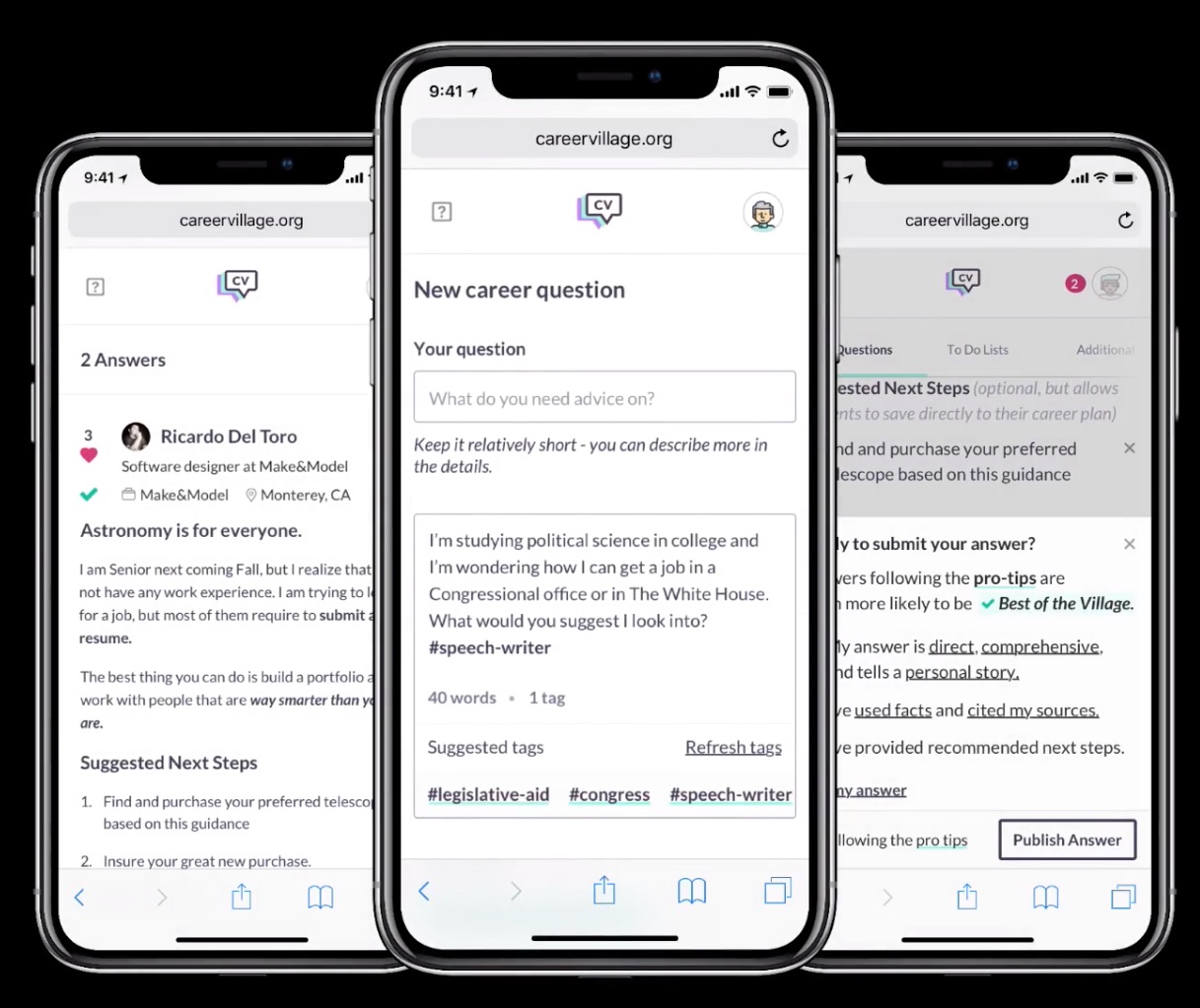
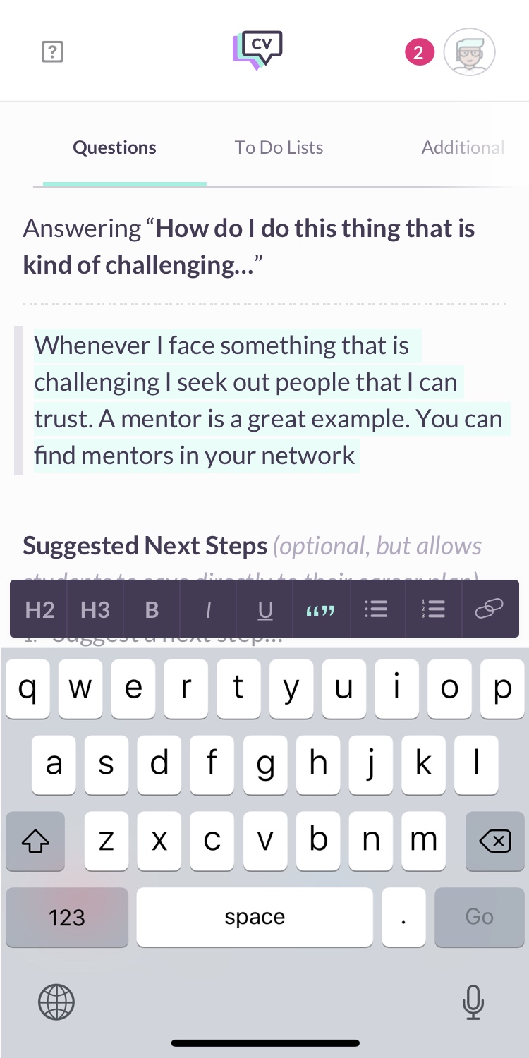
Designing formatting tools at its core was about solving the problem of low answer readership. A big reason students spent very little time in answers was because answers looked very uninteresting. There wasn’t any styling to them, it was impossible to add a heading title, a quote or even link to a source. Formatting tools allows professional users to adequately write a detailed answer that is segmented and cited.
Designing an interface that encourages the tagging of content
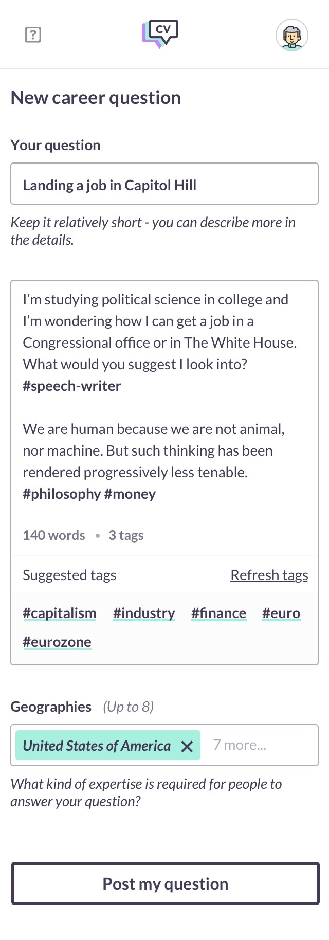
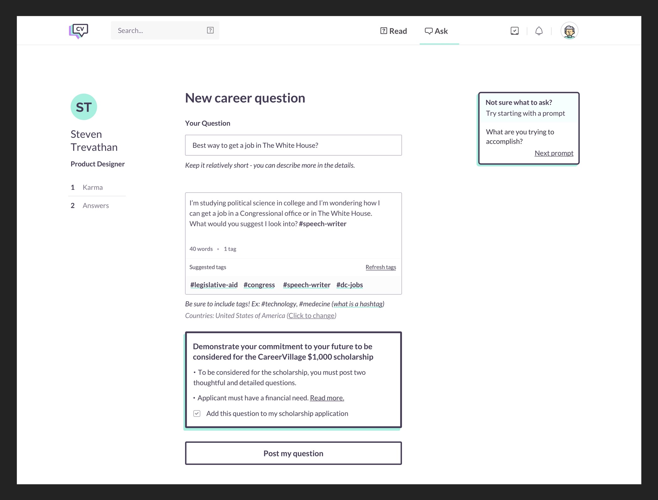
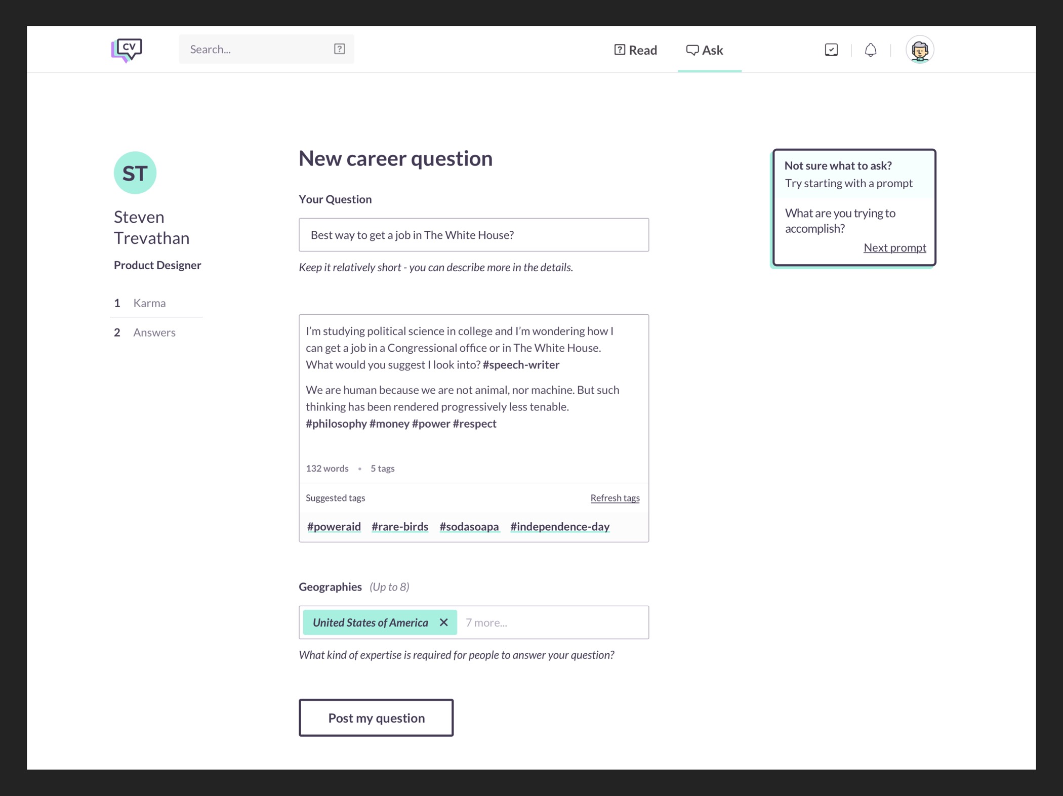
Adequately categorizing content is incredibly important because we want the best possible answer for our student users. Tagging content is incredibly tedious, time consuming and often causes users to leave the site. The solution that met our objectives was to design an interface that predicts possible tags based on previous information, such as titles and descriptions.
Designing features to think of the business beyond Q&A
Student users are young, they’re typically between the ages of 16-18 and they’re getting ready to go to college. How does CareerVillage retain their usage after they enter university. At this point, the QA portion of the product doesn’t really serve them very well. Presumably, they’ve set their minds on their major and are confident about their choice. How do we continue providing value to these users.
Designing systems to improve the quality of answers
The value of CareerVillage is the answers. Working on systems to improve answers not only gives CareerVillage a competitive advantage, it also serves our users and allows us to stay true to our mission of making career knowledge more accessible. Increasing the quality of the answers posted to the site required designing systems that not only encourage good answers but clearly defined what makes an answer a valuable one to students.
Design Case Study
My role at CareerVillage & Make&Model
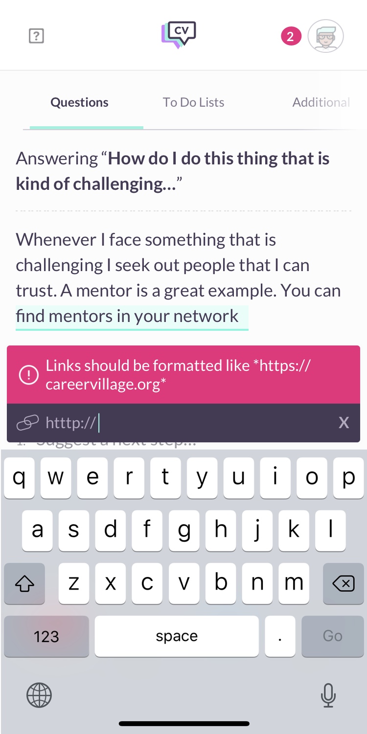
During my contracted time at Make&Model, I designed various interfaces to advance the mission of CareerVillage. I designed Career Goals, a feature dedicated to students and professionals. This feature allows students to build their career goals and for professionals to give feedback and guidance on how to achieve those goals. I was also responsible for designing systems to ensure our professional users provide answers that are useful to our students. Formatting tools were an important step in making CareerVillage a more useful platform for students. I designed formatting tools, including ways of gracefully handling user errors. This specially applies to the way people format links. Designing interfaces that gracefully adapted to user error was critical because of the user base using this application. The core objective of everything I worked on was to improve usage metrics and make the product more useful for more people CareerVillage team.
I worked alongisde Steven Trevathan, my manager and the other designer on the team. I also collaborated closely with members of the CareerVillage staff to understand the goals of the business and to hear feedback on potential solutions.
Solving the people problem of uninteresting answers
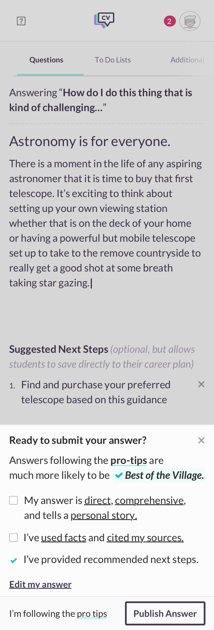
Answering questions is a big part of what makes CareerVillage the platform that it is today. The problem we wanted to solve was making content easier to read. A way to solve this problem is to provide formatting tools. Headings, links and quotes are a part of making a body of text easier to digest and much more useful. I want to briefly mention how we came to the solutions we eventually shipped. Constraints very much influenced the design process here. For one, our user-base is largely kids between the ages of 14-18. This meant that we had to design interfaces that are precise but also gracefully adapt to user error and suggest ways of fixing what is wrong. Our formatting tools are also very conventional because of our user base but also because of engineering and time constraints. It was important to get these features out and tested for effectiveness.
How this problem was affecting the business
Answers were experiencing very low usage times. People would quickly leave the page and do something else, usually outside of CareerVillage. It was really obvious that people weren’t reading the content. This is ultimately bad for the business because it means we’re not building a product that is providing value to users.
Defining success
If we were to solve this problem adequately, we had to see meaningful time spent on answer pages.
Research & user sentiment
The feedback from users was pretty universal: the reason they were not interested in engaging with the content or reading much of anything had to do with how it was presented. People felt that the time investment in reading wasn’t worth the reward. It was hard to know what they were getting into because the text did not allow for scanning and therefore people would lose interest and leave.
Understanding how competitors handle this problem
I looked at sites like Quora but I also looked at The New York Times, WaPo. One thing they all do is provide formatting tools to their authors. This allows authors to write with headings, add quotes, links and so on. This makes the content not just stronger content because it can be cited but it makes content that people can scan and want to read.
Possible alternatives to how people communicate
We thought of other ways to allow professionals to communicate with students. Video was a possibility. Video is a great way to communicate but it’s more limited in how it can be used and it introduces complexity that we couldn’t easily solve. Video is also much harder to do well. Giving advice that is useful also takes time and it’s hard to do that with video. The same applies with adding links and so on.
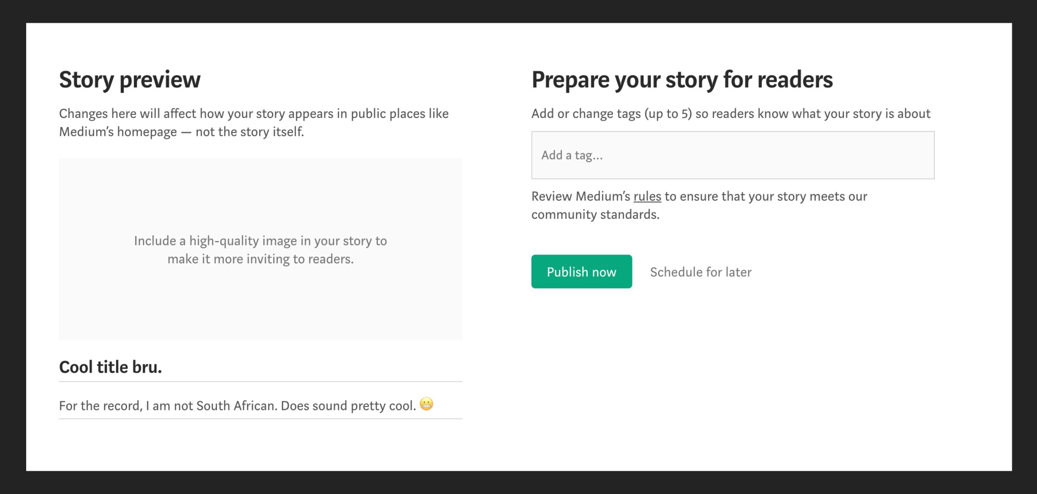
Our solution
After looking at competitors, our solution was pretty clear. Allowing our authors to be able to stylize their text was critical. Allowing them to add links to their answer, as well as other elements like bullet points would not only make their answers so much better but it would solve our problem of low readership. We had an idea this would work because it solved the biggest pain point users faced: text looked uninteresting. By allowing for headings, links, bulleted text and more, it makes the text easier to read and it makes it gleanable.
Design out come and what I would do differently with the information I have now
Formatting tools improved readership numbers, they made the answers more appealing and it increased usage times on that page. It increased it enough to where we were confident people were reading the answers, which was the goal from the very beginning. We solved this problem but I feel that we could’ve done better.
The tools that allow our professional users to write answers that are cited, quoted, have links and lists are somewhat hidden behind highlighting text or hovering over the text they want stylized. I think this is can be improved by making it more prominent. The prominence of these tools is something I’d like to improve. Ways to do this include showing signifiers in the interface that reference tools. This can be to the side of the paragraph and it sticks to where the cursor is. This is an approach that considers focus but we can also consider placing it near the top where it’s always visible and is activated based on users highlighting text. There are a lot of ways to solve this problem and make these tools more prominent, but one that I would consider is having it visual 100% of the time. This is because it’s easier to see it, sometimes people don’t click on things they don’t know and it’s also easy on our engineering team. It’s easier to reply and maintain, and for a company with limited resources, this is important.
Why do people construct write quality answers 🤔🧐
We started to asks ourselves why users behave this way. Putting your self in the shoes of a new user, it makes sense. If a new user makes a new account and they see a question they can potentially answer, there is no reference mechanism to understand how to write a well written answer. If you look at the competitive landscape, great answers vary by platform. A great answer on Yahoo Answers can be a poorly counteracted answer on Quora. The same applies to CareerVillage.
The business problem by having low quality answers on the site
The kind of answers that are posted to the site is critically important because it’s what differentiates CareerVillage from the rest of the market. If the quality of answers that are posted are short, without detail and generally poorly constructed, this affects the business because users will leave for another site like Quora where the quality of answers are generally pretty high.
Our goal was to educate users about what makes a great answer on CareerVillage.
Defining success
We were ultimately interested in seeing better answers. The way to measure this is by seeing more answers that are personal, cite sources and link to articles or other useful information.
How competitors appraoch this problem and what we could learn from them
I went through a few sites that allows for user generated content and they all have something in common: there is a mechanism in place that allows for user education. Quora does it as the user starts writing a question and reddit for example has subreddit rules and they’re always on the right side of the screen. Reddit typically has strong messaging that encourages people to read the rules. These rules are in place to encourage users to construct really well written questions or posts.
Our solution
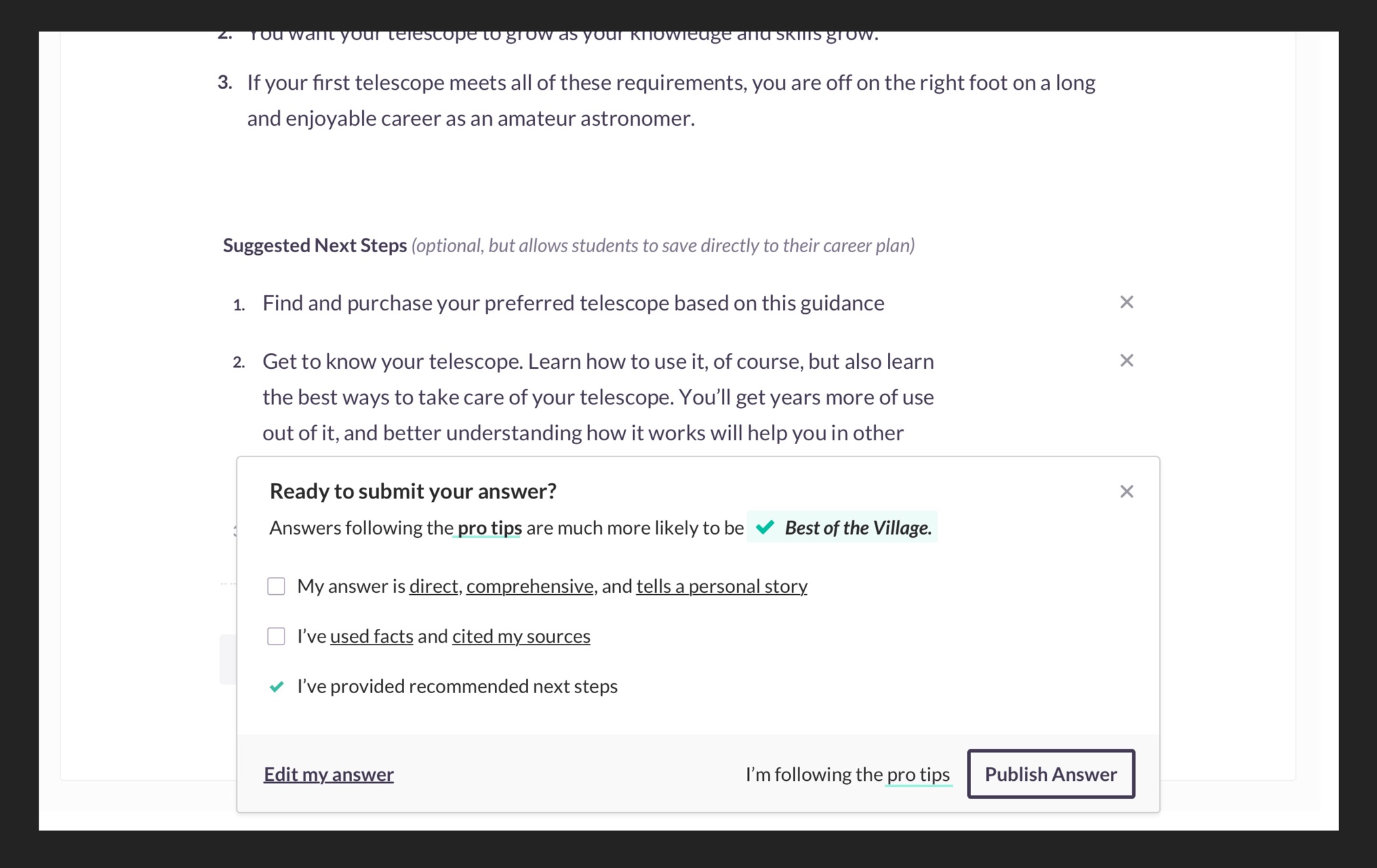
Our solution was to write a set of rules for answers. We called them 10 Pro Tips. These tips are a way to educate users on how to compose a well written answer. While this was a good approach, it wasn’t enough because we know user behavior and it’s really hard to get them to click on links.The way we solve this problem is by creating a reminder before posting, similar to Medium. What we do is remind them about the Top 10 Lists but also show the top 3 pieces of advice that we believe will make their answer that much better.
Design outcomes and what I would do differently
The outcome was an improvement but not where we wanted to ultimately be. Some answers remained short, without personal experience and without styling or links to sources. I believe it’s failing because while we suggest users to add lists or bold headings, discovery of the tools that allow users to do this is hidden.
After working on this, I would do things a little bit differently in how the user is educated. While reminding them of the rules before posting is useful, it can be daunting if they’ve just spent 20 minutes writing an answer and they have to go back and fix obvious mistakes. Reminding them as they write is possibly a more useful approach. I also think that users are not citing sources or using some of the tools we designed because they can’t find them. Making the tools that support a great answer easier to access is something I would want to change.
People are not discovering our platfrom — how can we change that 🤔
We were in a place where we felt that not enough students were using the platform to post questions and we wanted to introduce the site and its value to new users who are in the process of going to college. Our goal was simple: we wanted to introduce CareerVillage to more students and introduce them to the power of the platform.
How we defined success
If we were to solve this problem well, ideally we would see an uptick in usage and questions posted.
User discovery
Research about these users told us one thing: a lot of these students have questions and they are searching for scholarships online. Advertising there can be a great opportunity.
Possible solutions
There were other approaches we could’ve pursued, such as creating incentives to encourage users to make an account. Possibly showing 25% of an answer and to see the rest, an account is required. This could work but it has some drawbacks. A user might not be entirely sure what CareerVillage is and asking them to make an account without sufficient context is probably ineffective.
What we shipped
The solution we shipped involved targeting users who are interested in college and we proposed CareerVillage as a place to post questions and enter into a lottery for a scholarship. This approach was ineffective and we learned a lot from this failure. An important lesson for my self and for the team.
This failed — There is a lot I would do differently
This was a really bad way to introduce people to CareerVillage. The way CareerVillage was advertised was misguided. It didn’t highlight the strengths of the platform, instead it mentioned how users could get a scholarship. The ad was not about the value the platform could provide, it was about how it could monetary benefit the student. The value of CareerVillage is the knowledge, it’s not monetary.
I would do a lot differently. I would propose my ideas to my team in a way that better highlights value and backs up the ideas with case studies that show how other people were able to succeed in this area. My solutions would be focused on providing value and informing the user in the strengths of the platform. One example can be something as simple as a read later feature. If a user is reading a long answer, proposing the ability to read later is an idea that could lead them to create an account. We can also track user activity. If we see they’ve been reading content about medicine, we can show a list of similar content and ask them to make an account to learn more about a subject we already know they’re browsing. All these approaches have one thing in common: they give users a reason to want to make an account.
Why aren't people writing tags when they write a question 🤨🤔🧐
The people problem was obvious: why aren’t people tagging content. We started to ask ourselves why this was the case. Was it because it was hidden? Perhaps they didn’t know why they should. Or maybe they thought they didn’t have to and it wasn’t worth their time.
The business problem introduced by limited tags
Tagging content on CareerVillage is by far the most important part of any user generated content. Without tags, it’s impossible to serve content that is relevant to users. If we don’t solve this problem well, it’s a huge problem for the business because serving content that is relevant is hugely important to retaining the usage of both professional users and our student users
What success looks like 😏🤓
If we solved the problem of tags well, we would see a lot more questions with more than one tag and we would see more personable content served because of it.
Understanding user barriers and research
Tagging is hard and users don’t know the consequences of not tagging, nor should they have to. Allowing users to tag content themselves is not only a barrier in the process but it’s also detrimental to the platform as a whole because diversity in tags can be impeding. Research shows that tags tend to be pretty similar for similar content and this narrows down the index. By automating this, we can apply more tags and more diverse tags to new content. The UK government wrote a great post that heavily influenced this design process Learning how people tag content — gov.uk
Our objective
Design an experience that makes tagging simple. Based on the research we did, tagging is generally hard to do. This is specially the case if the content touches on different areas, which a question can touch on different subjects. It was best to automate this process and let users confirm the tags. This method has the added advantage that it can give people ideas for tags that might not be automatically generated.
How other platforms work with this problem
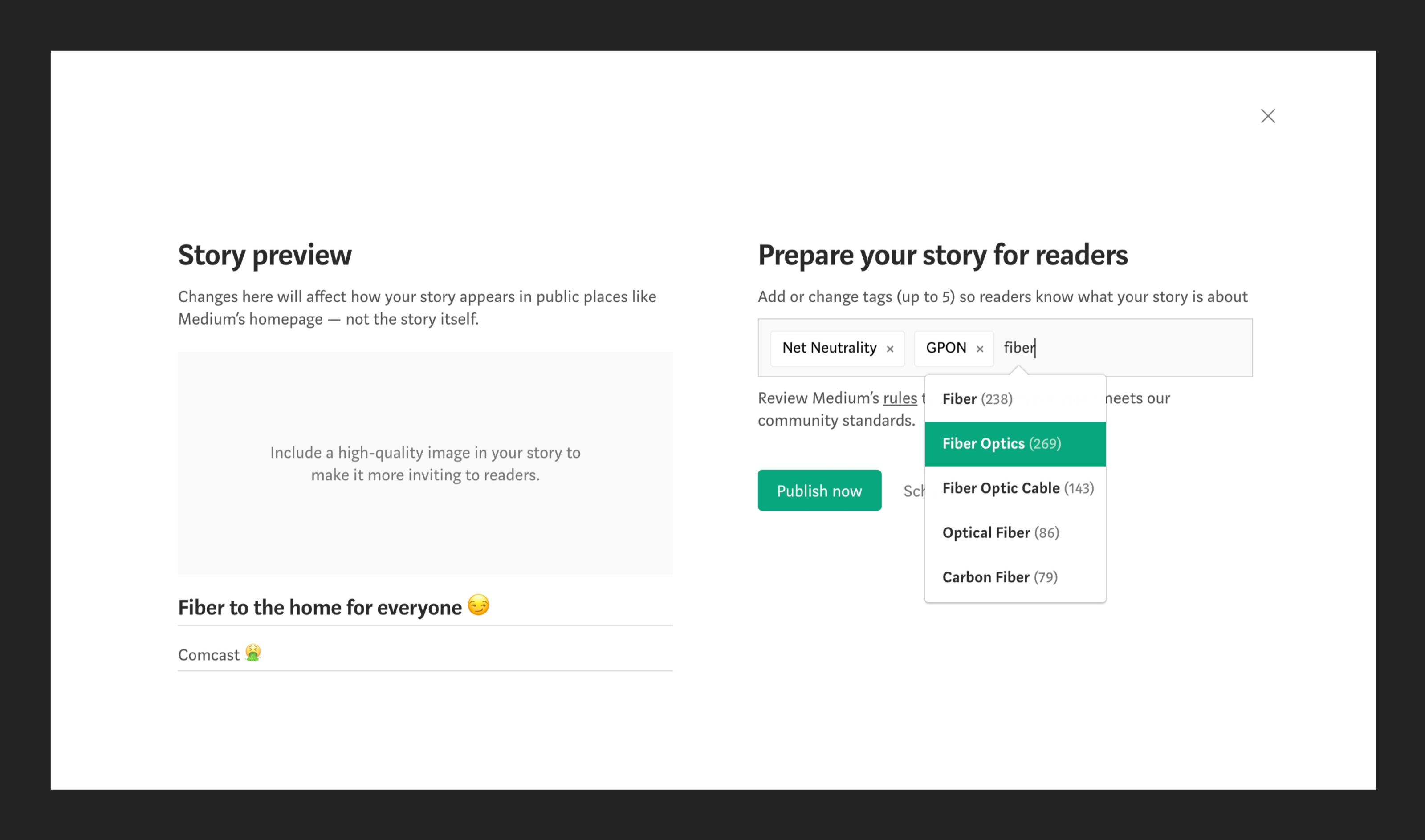
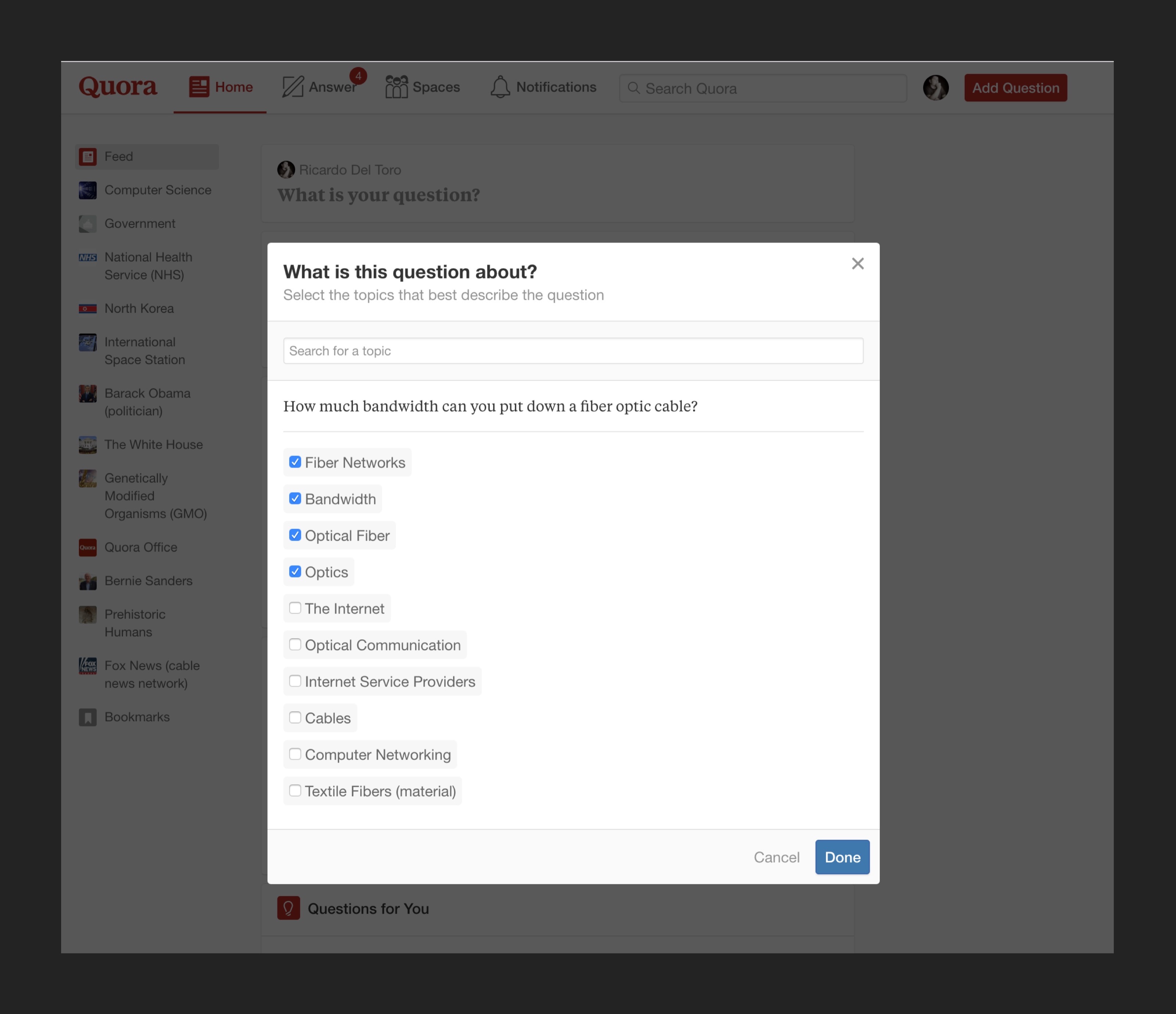
The way competitors approach this problem is by assisting the user in the tagging process. Quora does this really well. Tags are not part of the process when they’re writing a question, it’s only part of the process before they post a question and to a large extent, Quora already knows which tags to apply, it’s only up to the user to confirm them. Medium requires users to write tags manually but it’s emphasized heavily in the interface, because it’s probably critical to the indexing process. YouTube is in its own world, tagging is not heavily emphasized or even automated. My guess is that it isn’t hugely important to the way YouTube indexes. While learning how YouTube handles tags was interesting, it wasn’t useful because of how AI plays a role in a lot of Google’s products. I think a more useful competitor to analyze is something like Medium where our technology is more similar than something like YouTube.
Our solution and results
The outcome of this is solution is pretty positive. A lot more questions have tags and multiple tags as well. There is a requirement of one tag to post but a lot of questions have multiple tags attached to them. The result of this outcome being positive means that the content that is being served to other people is more accurate to their needs. As a result, the content that is being served is more valuable to more people and makes the platform a more competitive product to a wider audience.
Why would people continue using CareerVillage when they enter college 🤔🧐🤨
Student users are young, they’re typically between the ages of 16-18 and they’re getting ready to go to college. How does CareerVillage retain their usage after they enter university. At this point, the QA portion of the product doesn’t really serve them very well. Presumably, they’ve set their minds on their major and are confident about their choice. The challeneg becomes, how do we continue providing value to these users.
Defining success
If we succeeded in this area, we would see engagement in Career Goals over the course of a few months.
Research process — designing beyond Q&A
We did some research to understand what could be of value to students in college and how our product can help them succeed afterwards.
There are things we could build to help students succeed. It can range from designing private groups where students can exchange ideas and learn more about a field together to something like a virtual study group. While these things are of value, there are competitors that do similar things much better with established user bases. Pursuing such ideas also didn’t account for our professional users, who care a core part of the experience.
Our solution
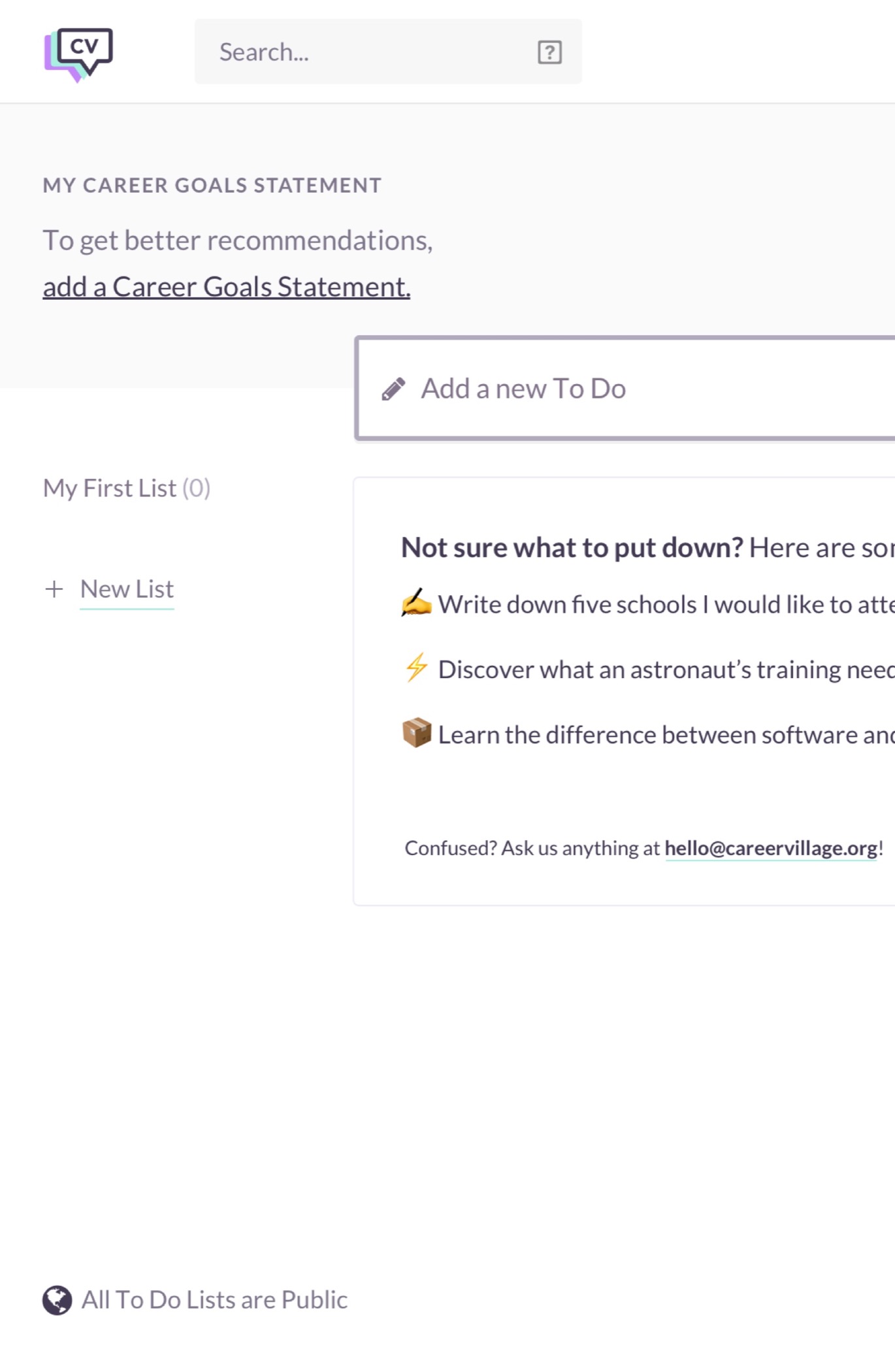
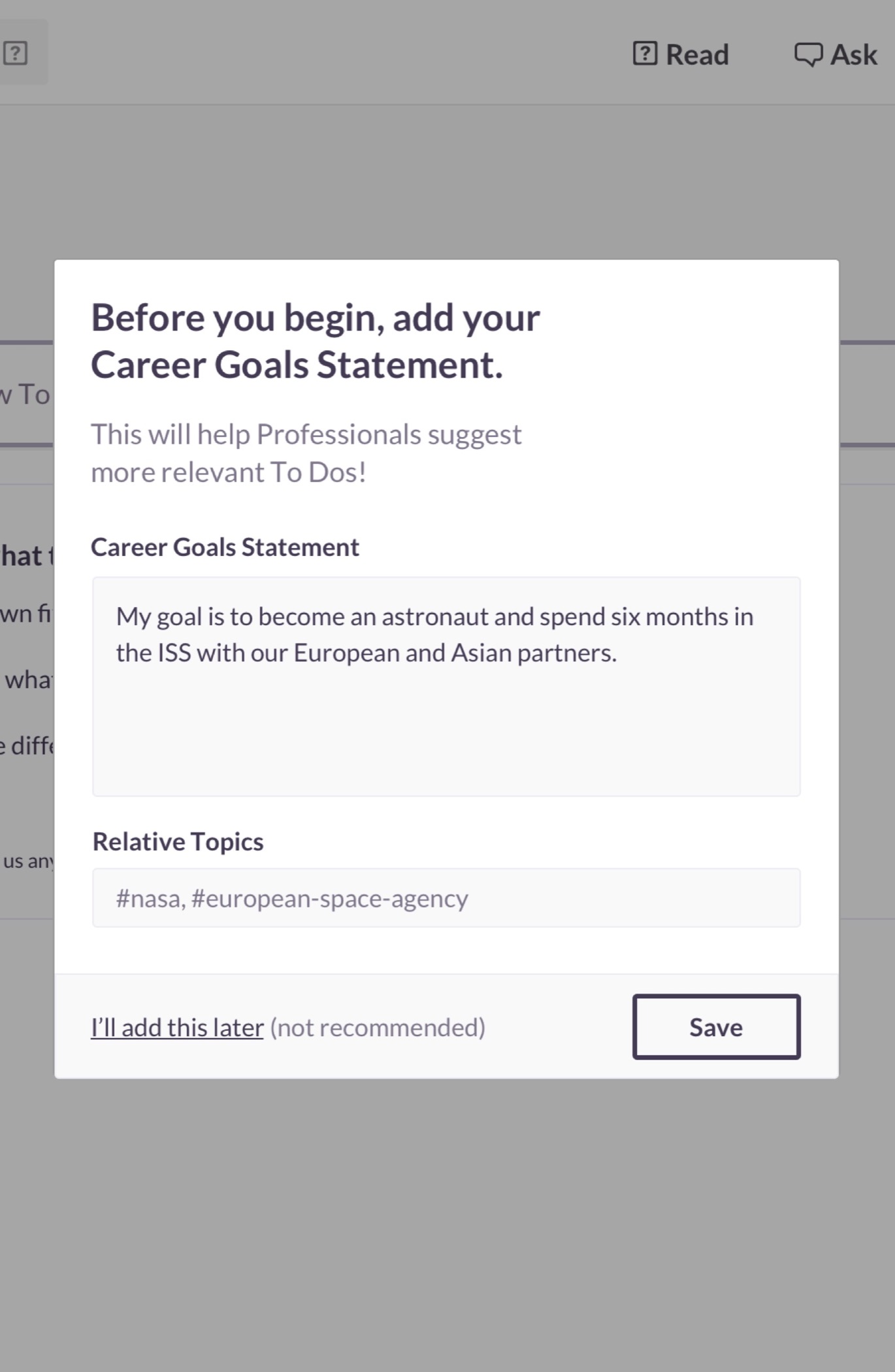
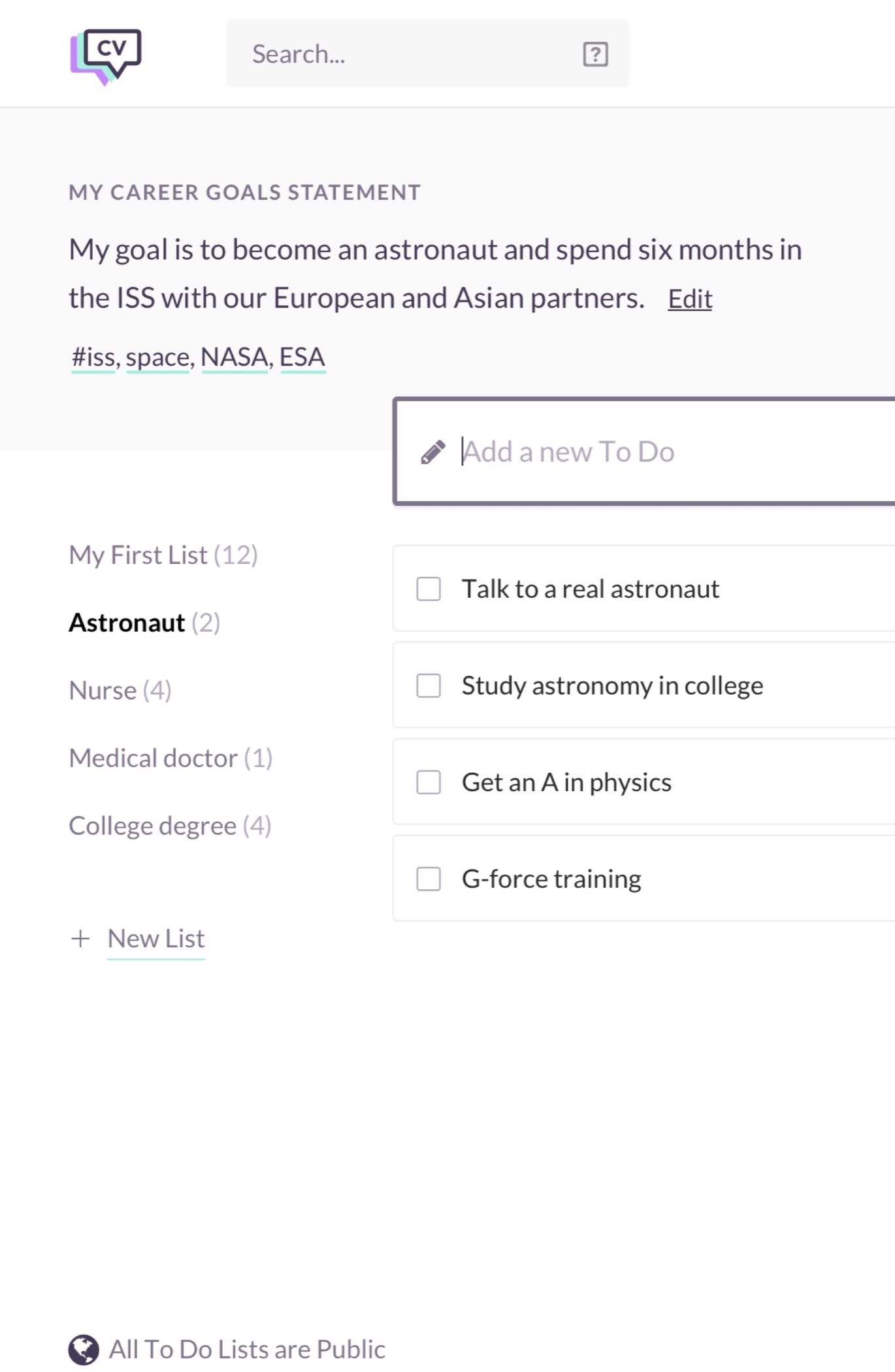
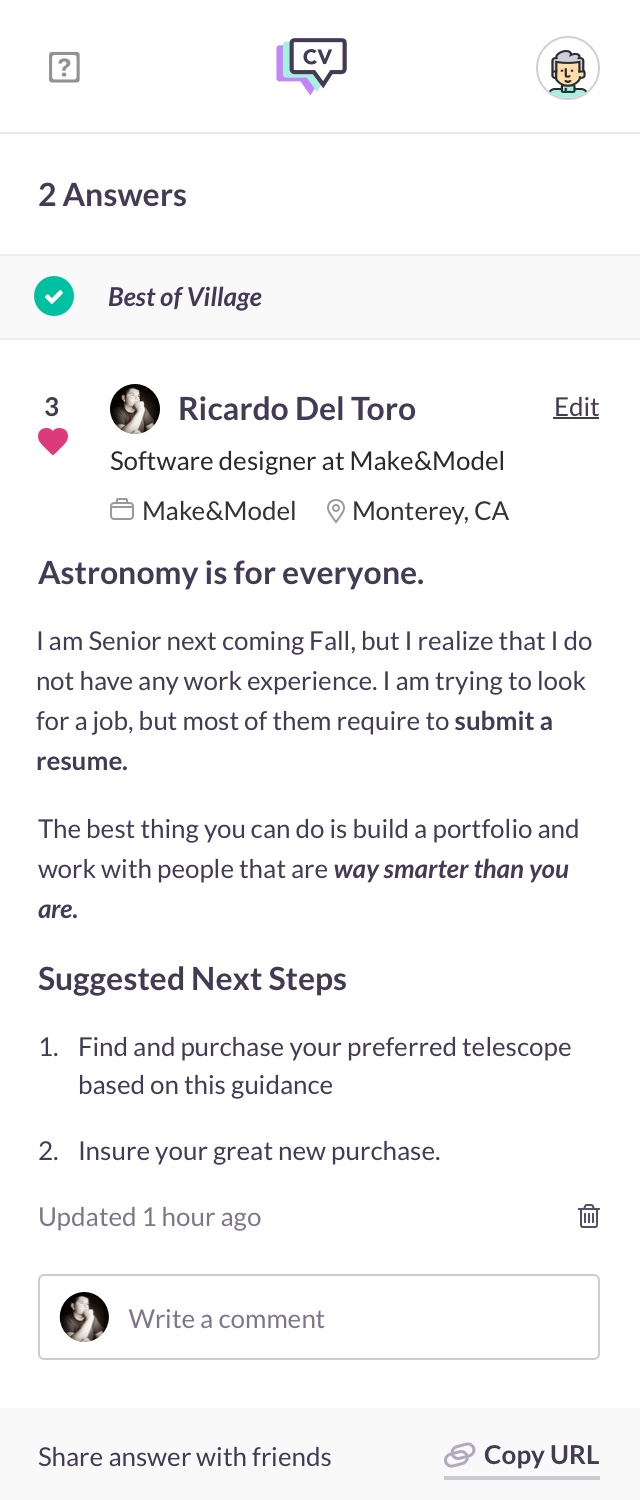
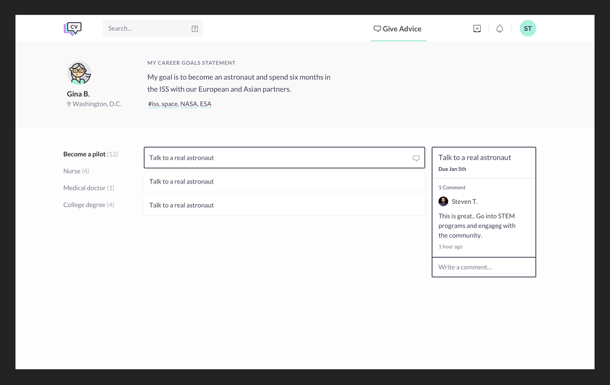
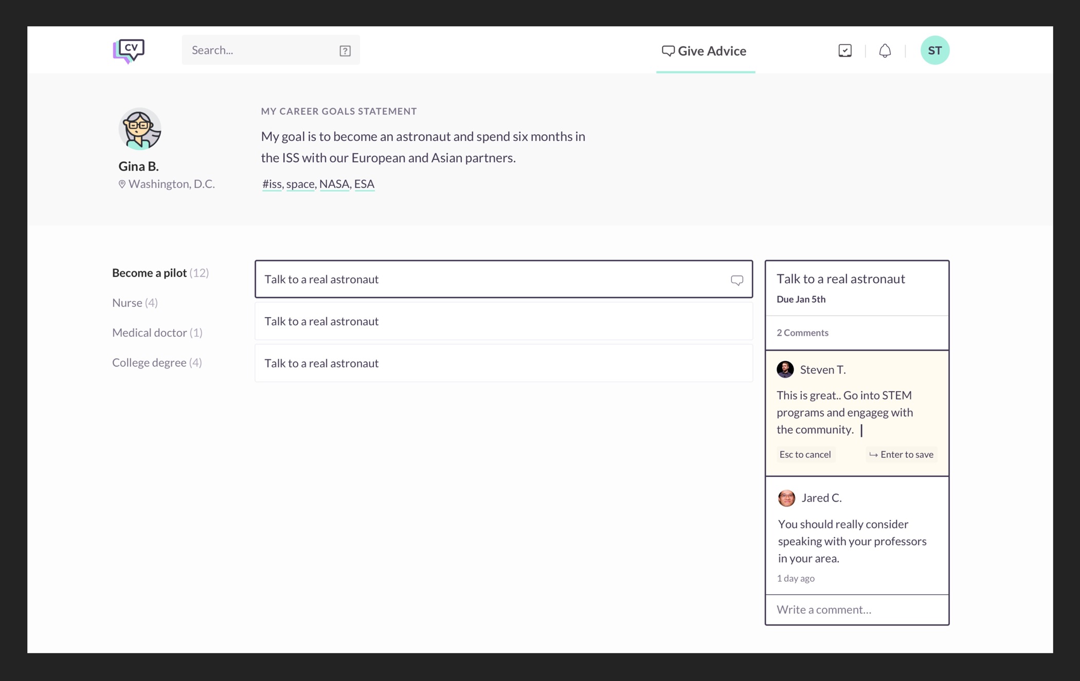
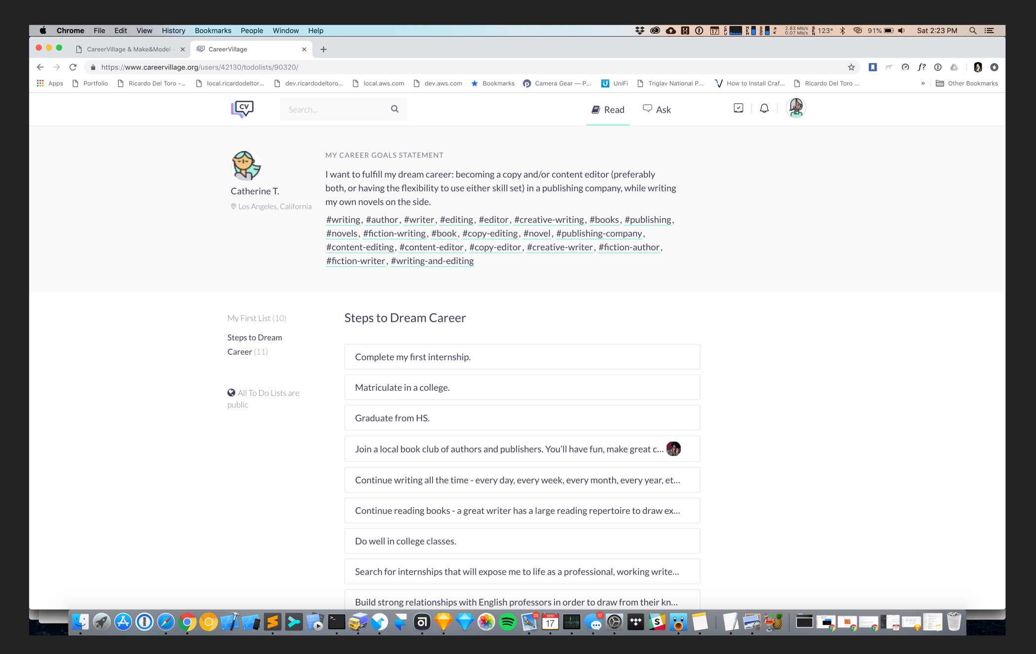
Our goal from the beginning was to provide additional value that would keep users coming back. One way to do that is to build an environment that hopefully fosters mentorship. This inspired Career Goals, an environment where students can post more detailed steps on how they plan to succeed in a field. This allows professional users to comment and provide more direct feedback on their goals. This feature is more aligned with the values of the company and provides value that can’t be found anywhere else.
Evaluating the success of this feature and what I would do differently
Career Goals are being used but the response from professionals is not where it should be. The quality of the content is not great and a lot of Career Goals don't receive much engagement. A way to improve engagement is to make Career Goals easier to find. They’re currently on a tabbed system and they’re being presented as To Dos, rather than Career Goals. The rest of the app, including where users create these Todos, they’re referred to as Career Goals. I think that consistency should be retained across the entire experience to allow the features to be discovered. I would also leverage the traffic questions receive and introduce career goals, along side questions.
Concluding thoughts
CareerVillage is a project I’m incredibly proud of, the mission of the company is noble and I believe this product has real potential to help people. CareerVillage is a much better product today than it was when I started working on it. By no means do I take credit for where it is today. It wouldn’t be here without the entire team, from my self to Steven, my manager to the rest of the team staff at CareerVillage. Like all great products, CareerVillage is something that needs constant iteration and things have been slightly tweaked since my departure. Proud of this work and the people I worked with.
Next Project
DME by Soliton Systems
DME, now owned by Soliton Systems is the leading provider in secure device management with clients throughout the world. DME (Dynamic Mobile Exchange) is an application for corporations and governments to securely exchange information and separate work and personal communication. In addition, DME allows clients to securely move files between devices and the corporate network. DME gives clients the power to protect company assets by allowing remote wipe of user’s work data.