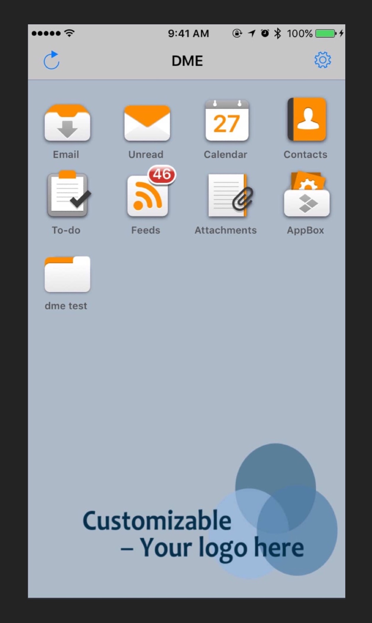
DME, now owned by Soliton Systems is the leading provider in secure device management with clients throughout the world. DME (Dynamic Mobile Exchange) is an application for corporations and governments to securely exchange information and separate work and personal communication. In addition, DME allows clients to securely move files between devices and the corporate network. DME gives clients the power to protect company assets by allowing remote wipe of user’s work data.
Design Highlights
Increasing usage of core features
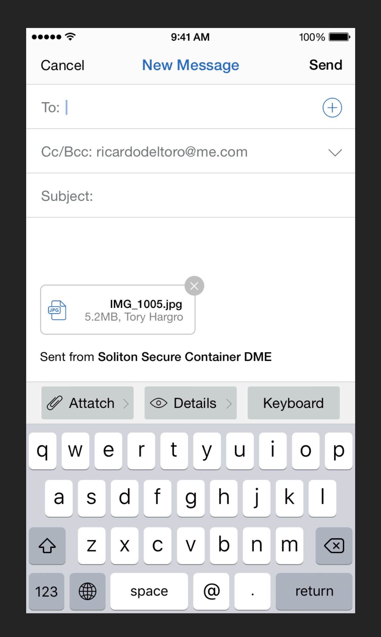
The core objective for Soliton Systems was to make DME a more appealing product to its current customer base and potential customers. The way we achieved this objective was to surface the strengths of DME, such as email encryption in the compose email interface in a simple and straightforward way.
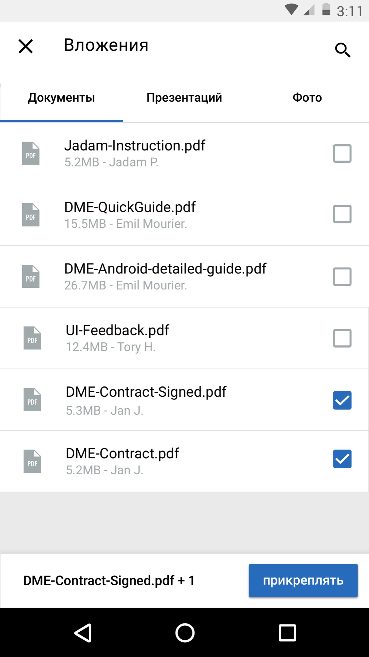
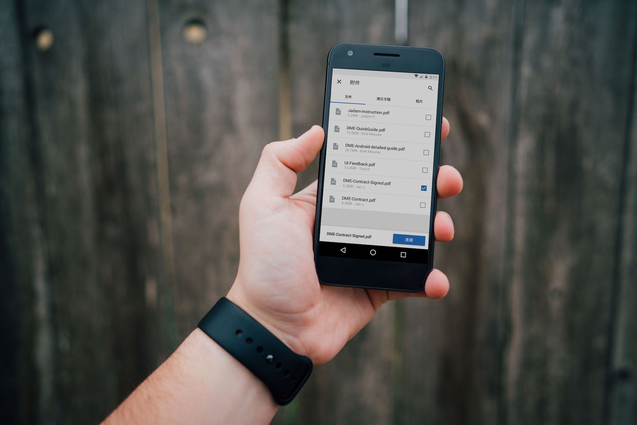
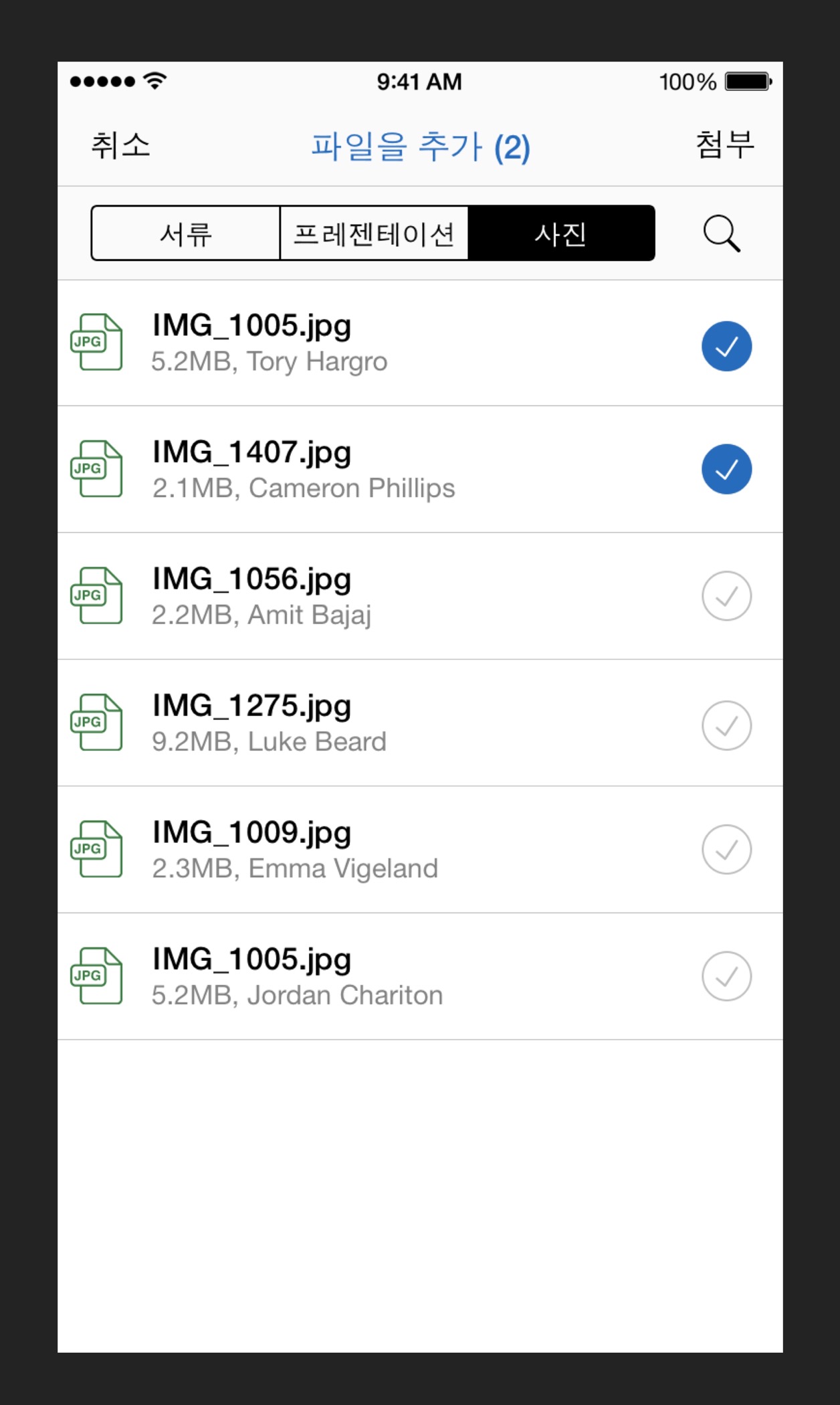
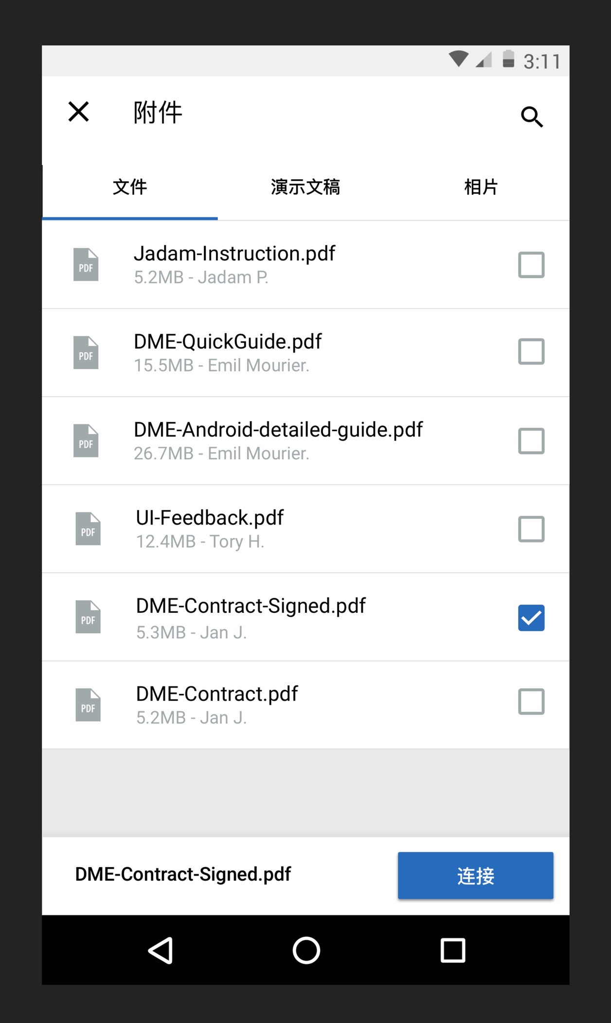
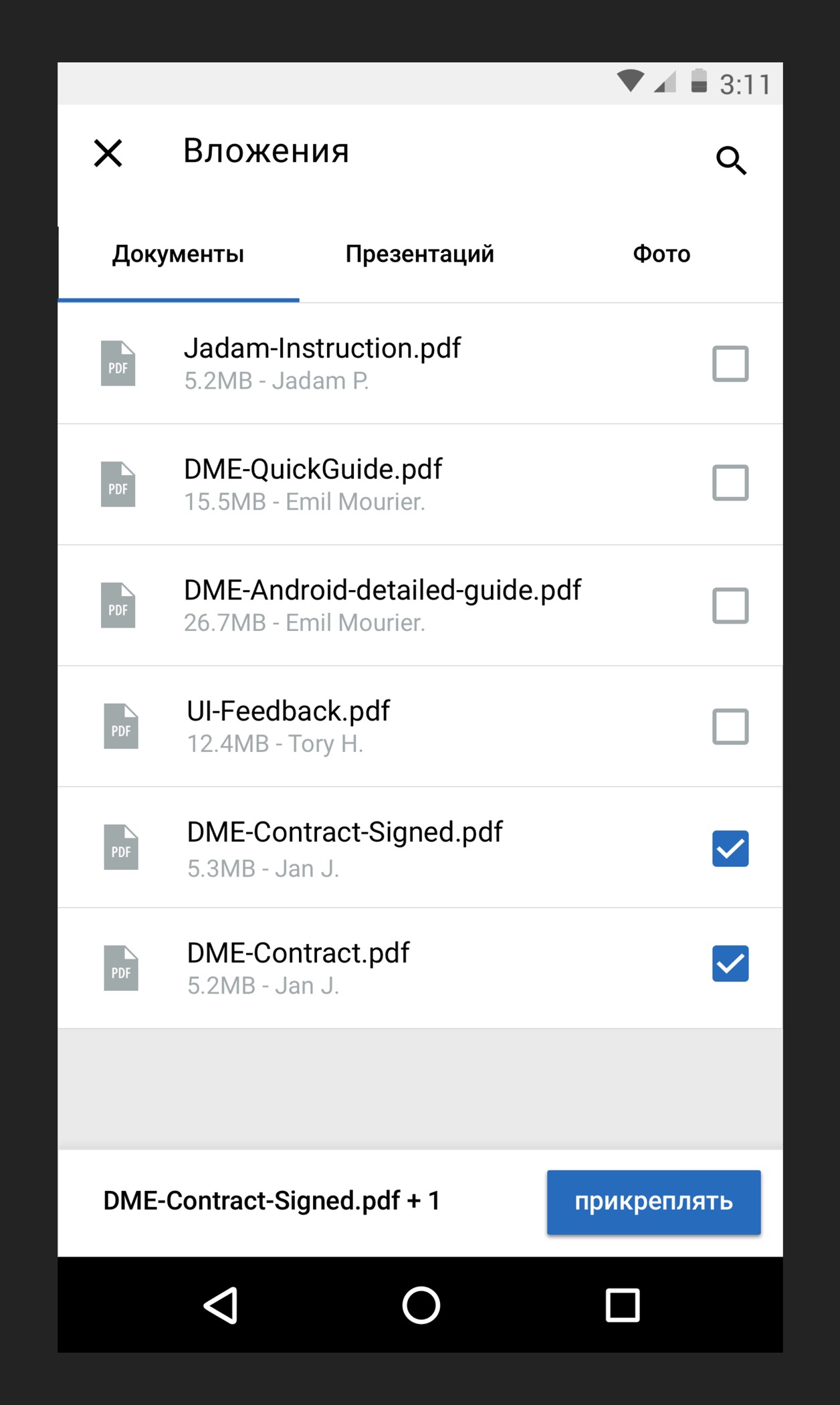
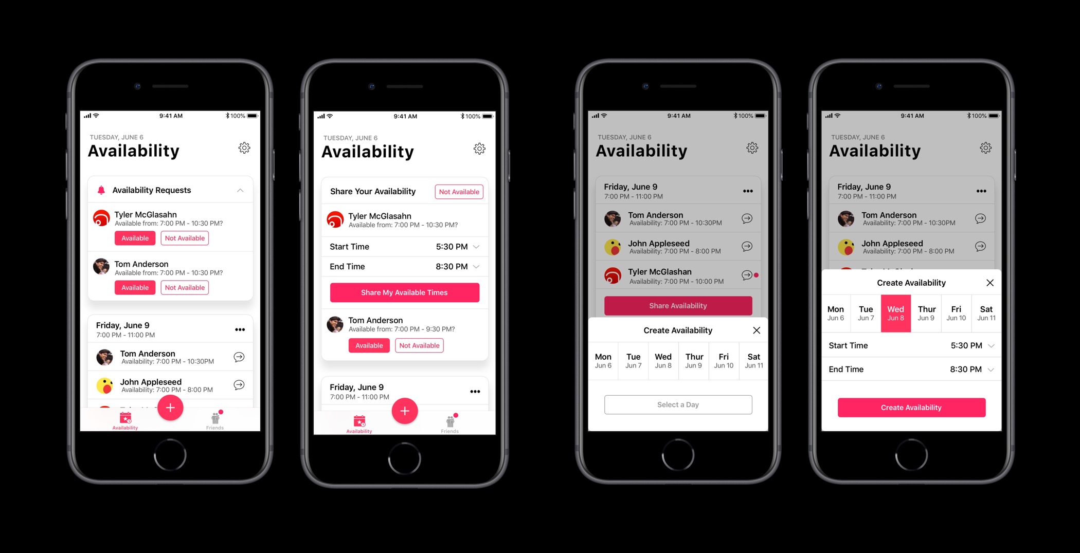
Designing a better file sharing system.
Designing a better file sharing system goes back to the core objective of Soliton Systems: making DME a more appealing product. File sharing was redesigned from the ground up with the consideration of the user base and their most commonly shared files.
Designing an international product
Designing a better file sharing system goes back to the core objective of Soliton Systems: making DME a more appealing product. File sharing was redesigned from the ground up with the consideration of the user base and their most commonly shared files.
The importance of design conventions in meeting our business objectives
Designing a better file sharing system goes back to the core objective of Soliton Systems: making DME a more appealing product. File sharing was redesigned from the ground up with the consideration of the user base and their most commonly shared files.
Design Case Study
My role in designing DME 5.0
Worked closely with management and the rest of the team to understand important business goals, deadlines, engineering and infrastructure limitations.
Explored solutions for DME 5.0 within the realms of conventional interfaces, for reasons involving timelines and engineering limitations.
Extensive prototyping in Origami Studio to test and validate design decisions.
Worked closely with engineering in providing implementation assistance. Provided detailed specifications of implementation details, along with prototypes to better communicate how a feature should be built.
Provided extensive feedback to engineering on internal builds and was available to answer any questions in connection to how the interface should be built.
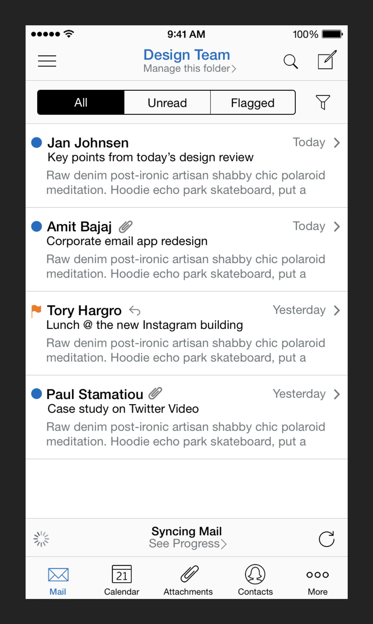
Version 4.0 — How its usability issues hindered its place in the market
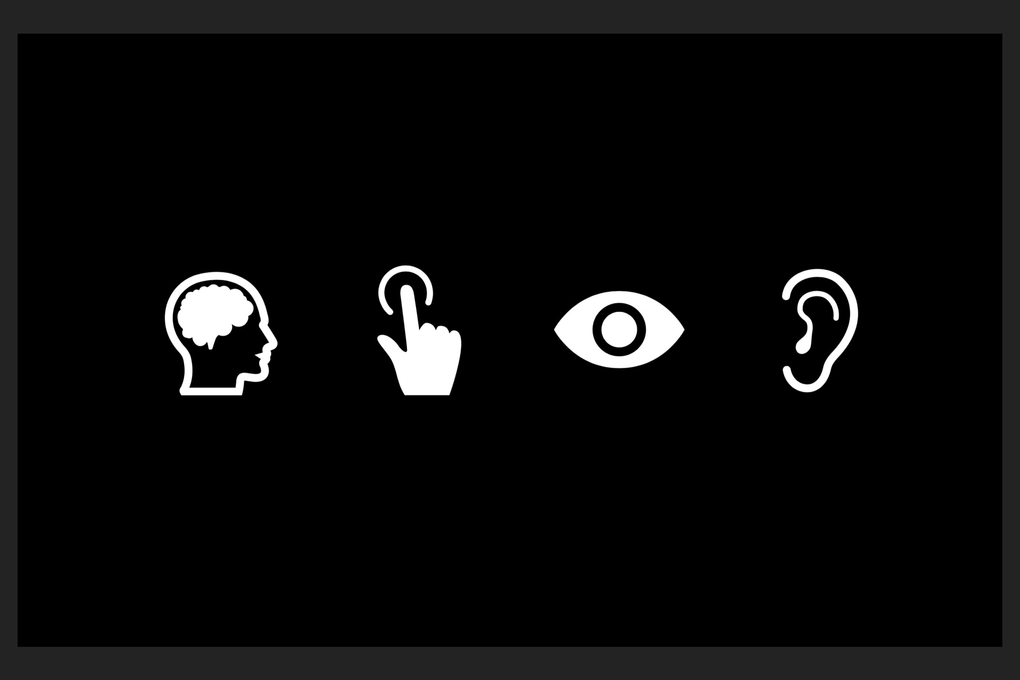
DME 4.0 relied heavily on vague iconography causing usability issues for users. Icons don’t scale well across different countries with different cultures and this was evident in the usage patterns for the app.
The product was unintuitive and the way the app handled navigational hierarchy was a critical factor. The way the app transitioned users into parts of the UI was different and proved difficult for users to orient themselves in the UI.
Version 4.0 of the app didn’t reflect today’s software in terms of aesthetics and this affected the way people thought of the app. It didn’t inspire confidence in buyers that the app was a secure way to exchange communications.
By designing solutions to solve important issues like making core functionality clearer in the interface to the modernization the UI. All these efforts made for a better DME. A DME that is a more competitive product in the market and a product that is well received by customers all around the world.
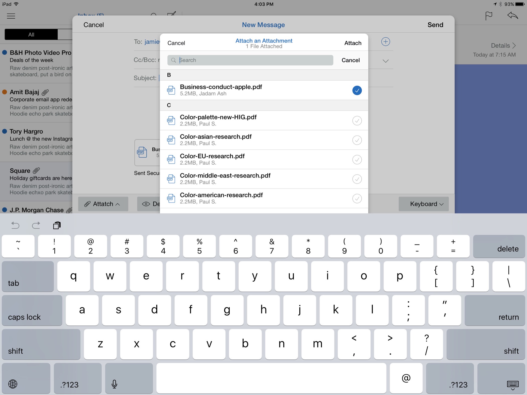
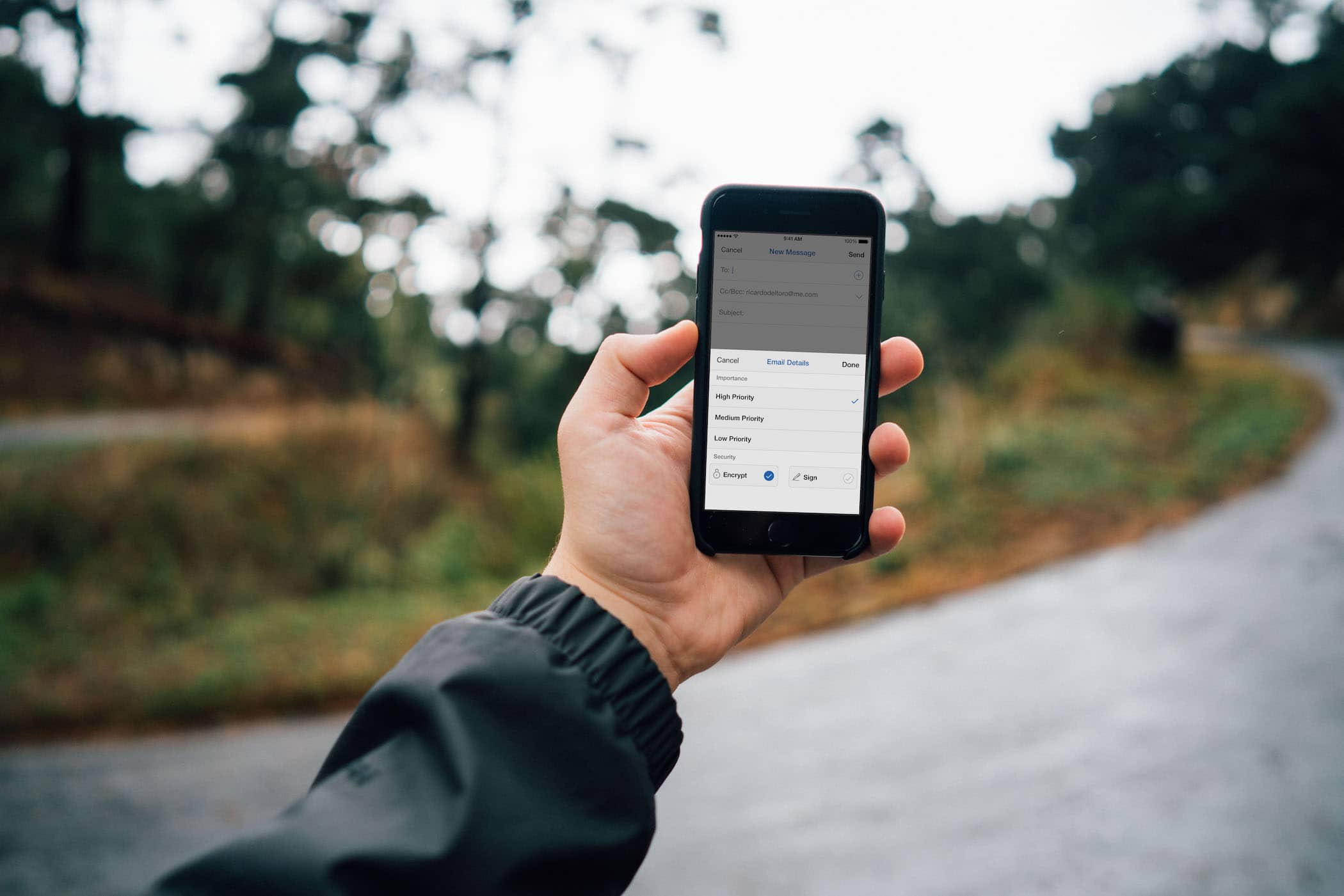
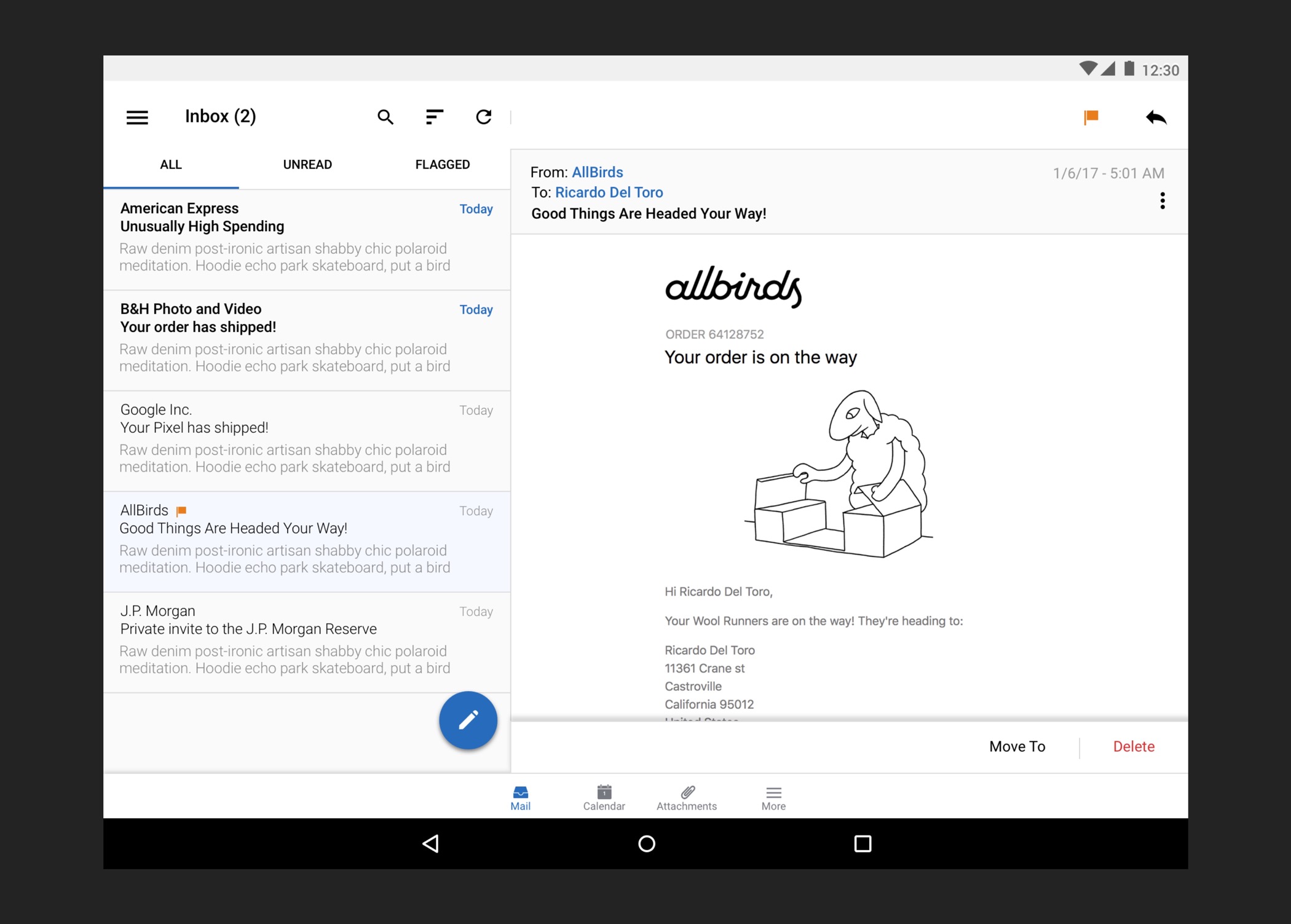
Encrypting email — how a poorly designed interface consumed support resources and affected the sales strategy
Version 4.0 of DME was introducing a lot of problems for Soliton Systems. Encrypting email is one of the core features that is advertised and sells the product, yet in version 4.0, finding such core functionality proved to be really difficult. The business problem is that it generates a high number of support tickets, it needs a user manual, which costs money to make and maintain and the fact that core functionality is hidden not only makes for a bad user experience but it makes it harder to sell the product.
Understanding the people problem
There was a sense of frustration among customers that they couldn’t encrypt their email. There were a lot of questions we asked: why? Is it because maybe they can’t find it. Maybe they don’t understand it? Maybe the person on the other end can’t receive an encrypted and the interface doesn’t show that capability.
Defining success
We defined success here by achieving less negative feedback and questions about a feature they thought they had access to but couldn’t find. We were also interested in the way people reacted to the sales team.
Research and user sentiment
During my time working on this project, it was really difficult to conduct user studies or interviews because the customer of this product is not the user. A lot of these users are corporate users and having access to them was very limiting. What was not limiting was the amount of feedback the company had compiled from their customers. Users were frustrated that they were sold on a feature they couldn’t access. In reality, the feature wasn’t restricted, they just couldn’t find it.
Design objective
Surface the feature that sell this product in the interface where they provide the most value.
Analyzing competitors and following established design patterns
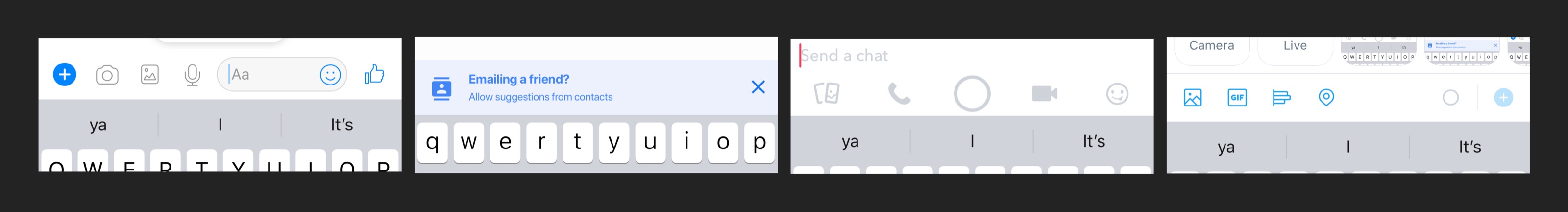
The competition in this field is somewhat limiting. However, DME is essentially an email app that is used and managed by one party. I looked at a plethora of communication apps to see how they make core features preeminent. Messaging apps make access to photos or location really easy to access. They do this because those features make the use case of a messaging app more useful. Being able to share location data, photos, audio and so on makes the app more valuable. I learned a lot from this part in my process and I took this information and applied it to my solution.
My solution
My solution was to make the features that sells the product prominent in the interface. Email encryption and file attachment is most useful in the composer interface and it is prominent in that interface.
Design outcome and what I would do differently
The outcome of redesigning the way people encrypt email changed the sentiment of a lot of users. Feedback I received was really positive. Metrics in this product were really hard to come by because apart from being an enterprise product, it’s also a product focused on privacy and a product that is self hosted. However, the information we did have was positive. Users were able to access the features that were sold to them the and the company no longer needed to update a user manual. Yes. That was a real document.
I would do a lot differently, specially how the current interface handles context and how it informs users of errors.
1. When a user taps encrypts and the modal view is dismissed, the interface doesn’t communicate that. Being able to know that the email you’re about to send is encrypted is incredibly important and something that should be communicated at all times.
2. When I was working on this problem, I wanted to address this edge case of sending emails to people that can’t receive encrypted emails. I think it’s important to be able to notify users that an email they’re about to send won’t be encrypted. Unfortunately, this was something I couldn’t work on because the infrastructure couldn’t support such a feature. If I had to pick one thing to be able to work on with this project, it would be that.
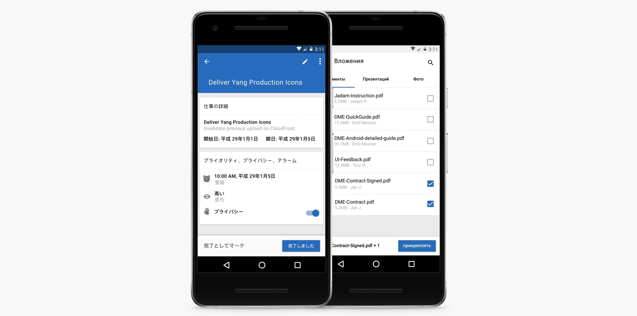
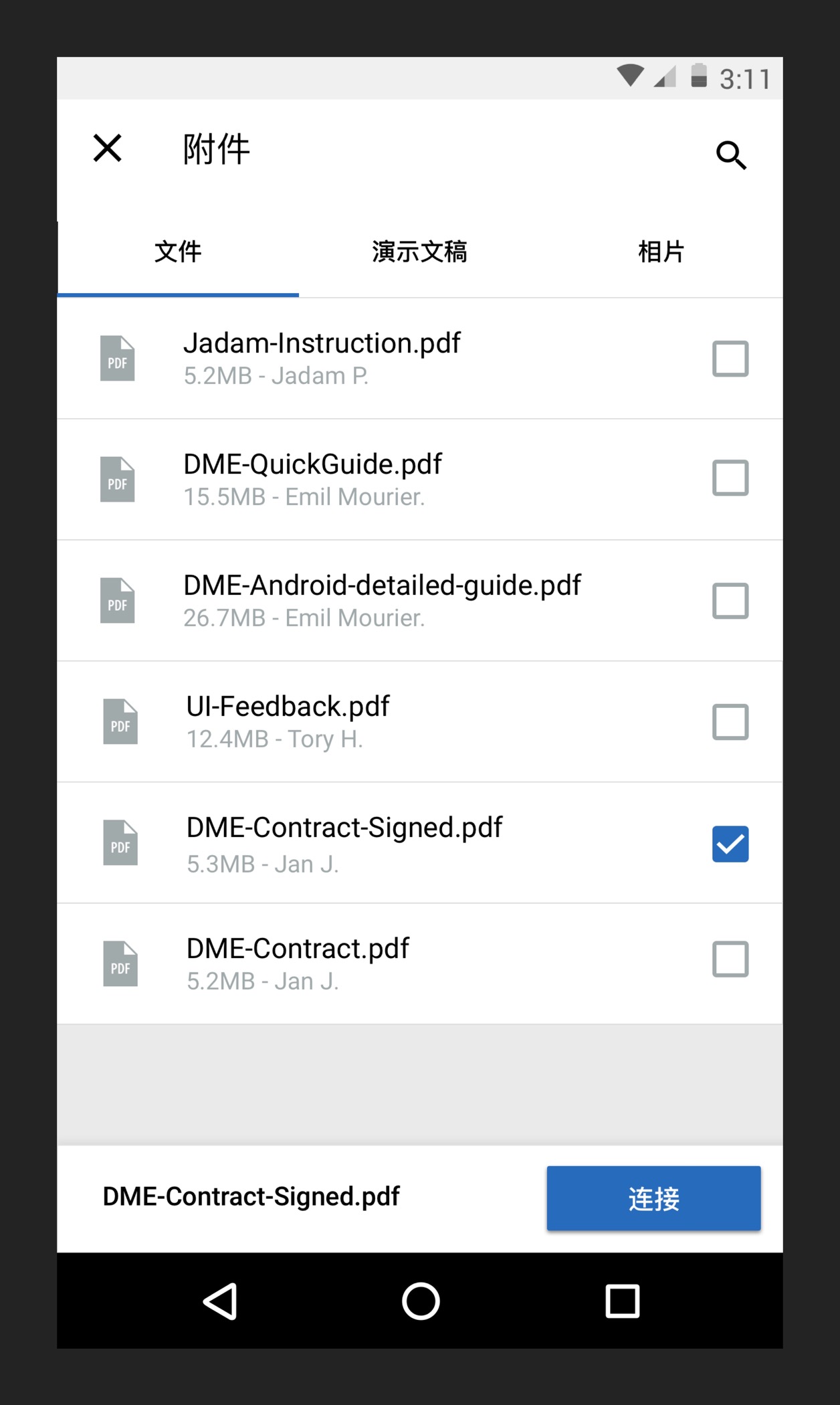
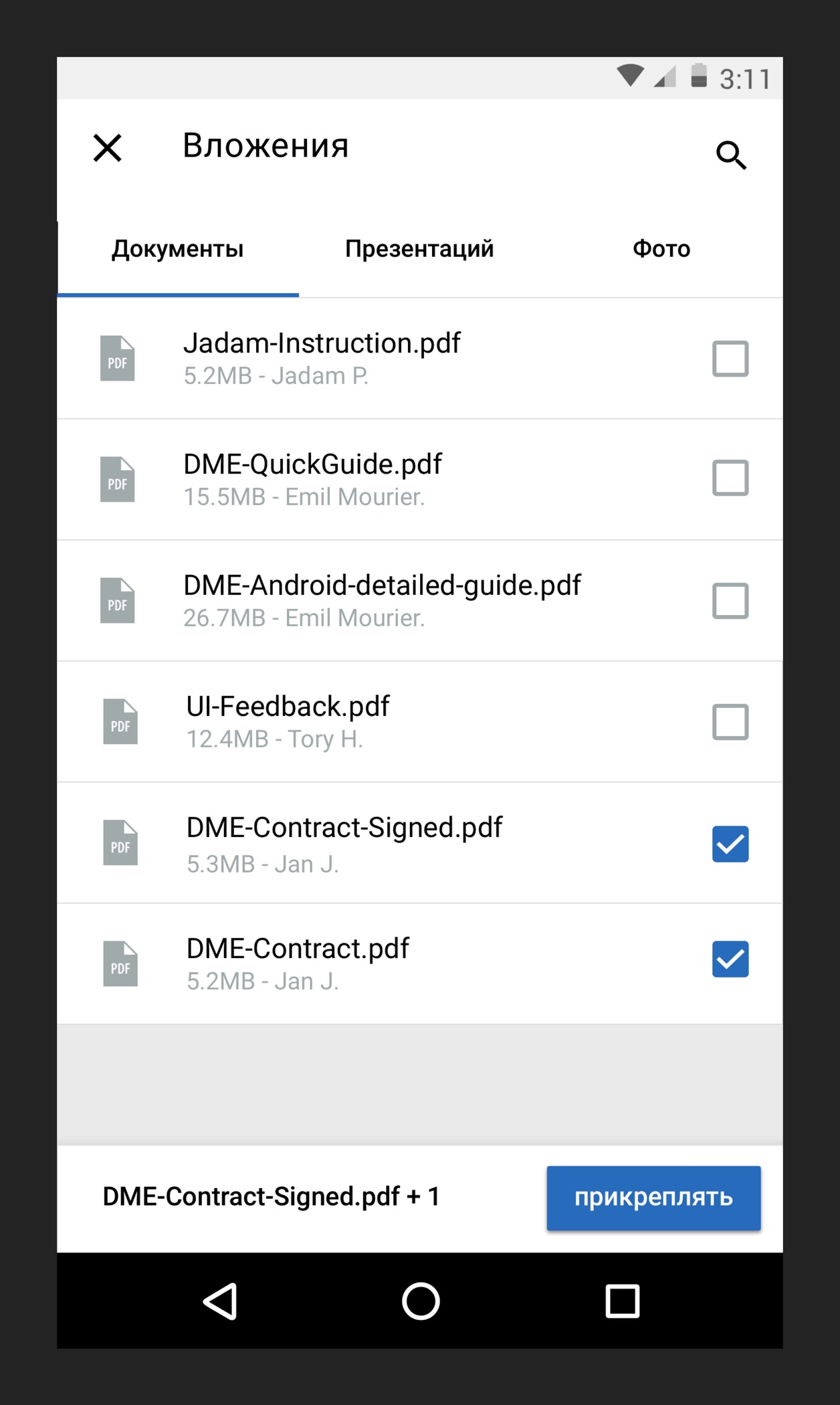
People struggling to understand how to move their emails to folders 😔
Another pain point faced by users was their inability to understand how to move an email to a folder. This prompted a lot of questions: were they having trouble finding it? Were they looking in the right place? Did they miss it?
The business problem introduced by issues of discovery
This is bread and butter functionality to an email app, yet the way it was handled was not very well. Discovery was a huge problem in this app and having a confusing app that didn’t follow design conventions affected the business because users were frustrated and frustrated users complaining to their company about a product they have to use has the potential to affect renewals of the subscription to the product.
Direct user feedback
User sentiment around these problems was extraordinarily clear: people are having trouble finding functionality they expect in an email client. While we didn’t have conversion metrics for moving email, it was clear by feedback that the company had received from customers in all regions.
How similar products handle this problem
If you look at other email apps, they make access to this feature in a really straightforward way. It makes sense, the use case to move an email to a different folder is an important feature and one that is commonly used. Most apps have access to it near the bottom where it’s easy to reach and most apps tend to use iconography to communicate this feature. There was a lot we could learn from out competitors and there was a lot we had to change to accommodate our user base.
Our goal
Our goal was simple: to surface core functionality that is critical to the usefulness of an email client.
My solution & what I would do differently
This solution is very good at handling one email at a time, and for the most part that is okay. However, if a user wants to move multiple emails to a folder, they have to do it one at a time. Changing the interface to support this might have some drawbacks because it introduced complexity. However, following closely followed design conventions cab be a way to mitigate the negative effects users might feel about the added complexity.
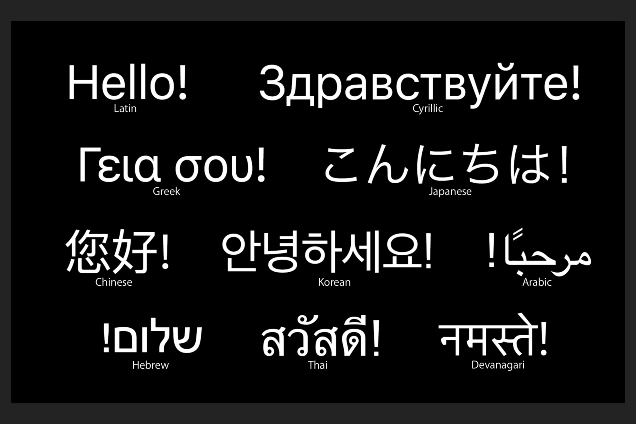
Designing an inclusive product — how characteristics in language systems influenced the design process
Understanding the customer base and requirements meant understanding the need to design an inclusive product.
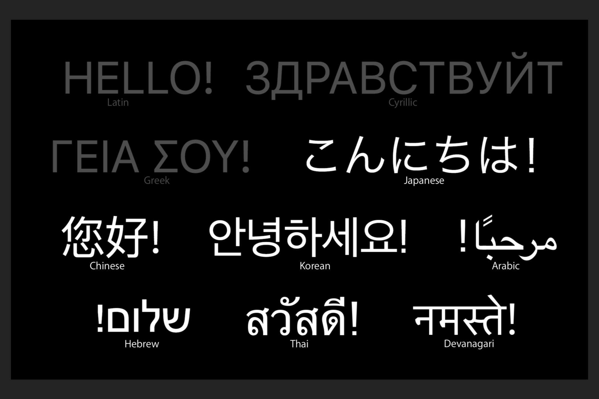
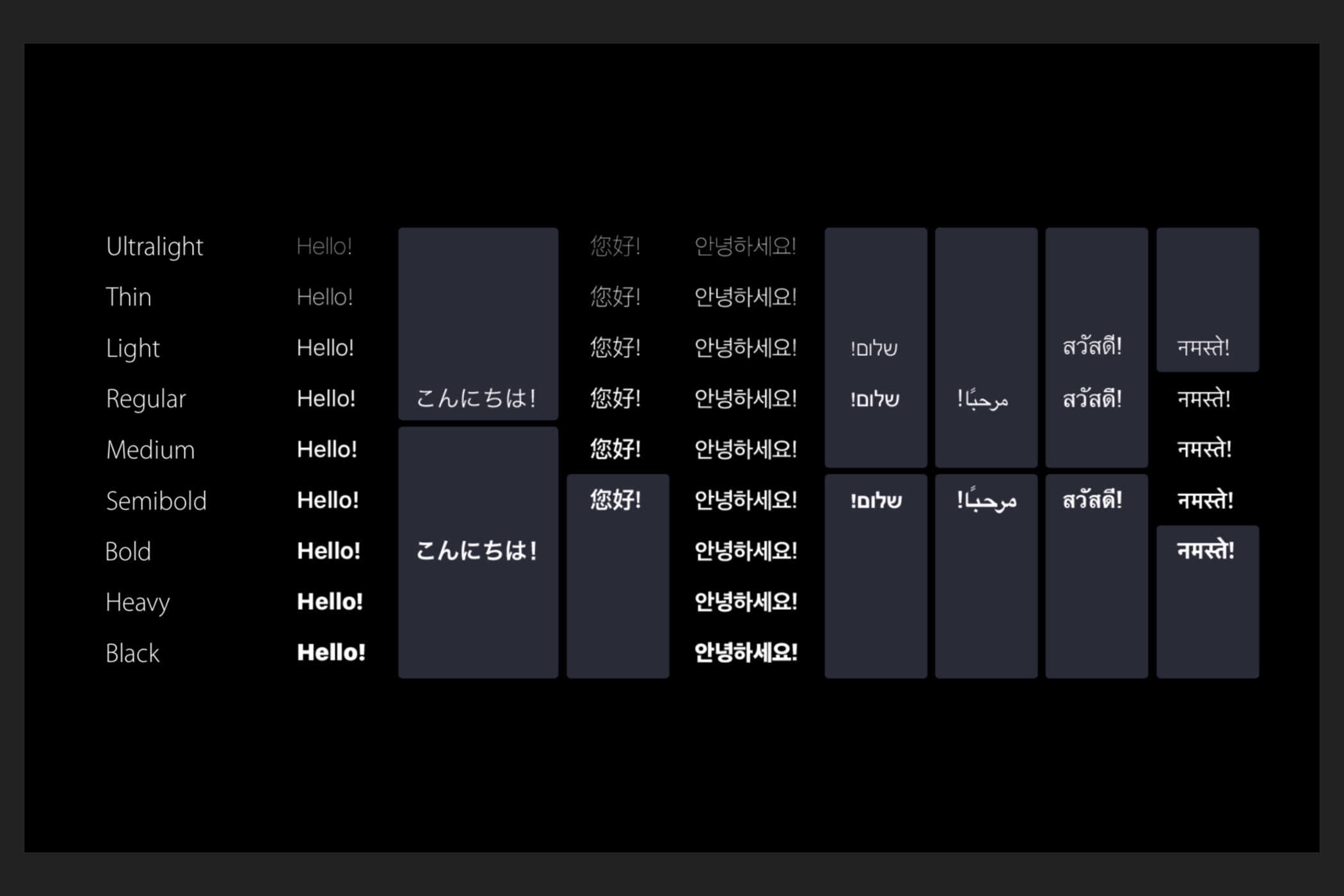
Designing with the requirement of 13 localizations in mind was an important part of the design process. Designing for 13 different language systems and future localization goals meant understanding how different language systems influence layout, hierarchy in the interface and how languages like Hebrew and Arabic influence layout through its right-to-left writing system.
An important consideration and one that influences the interface is how we convey hierarchy in our UI. The support for font-weights is not universal across languages and if colors and proper spacing isn’t well established in the interface, hierarchy can be lost.
Other characteristics that influenced DME were languages like Korean. The Korean alphabet, known as Hangul relies on digraph. Digraph is the pairing of characters. Languages like Korean need larger text-sizes to be legible and it’s absolutely necessary on lower resolution displays.
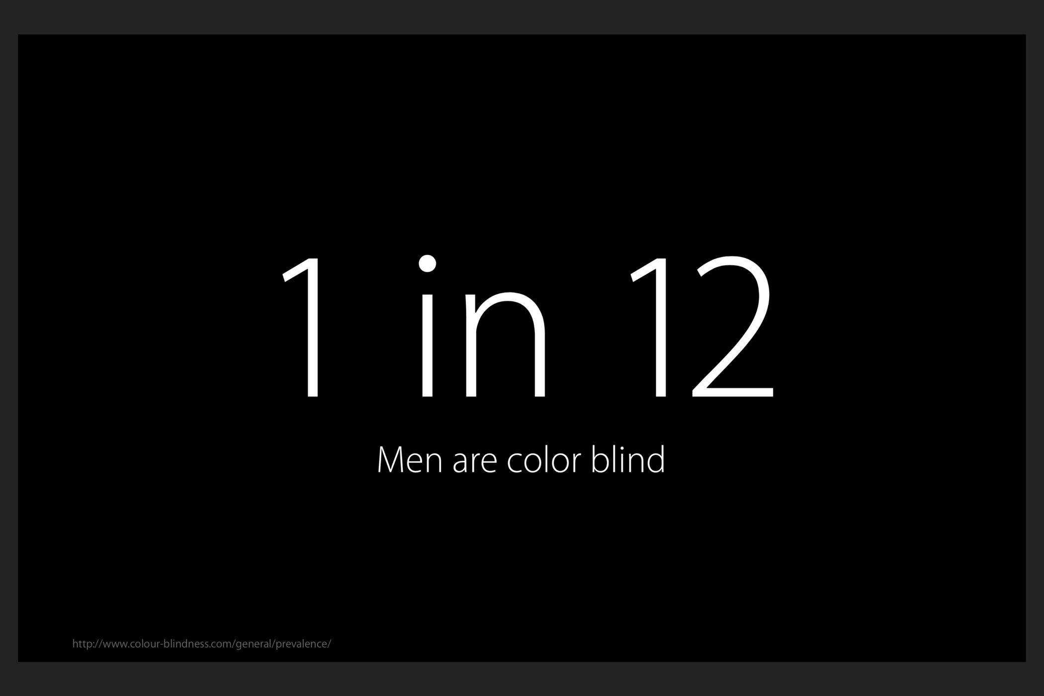
Inclusivity goes beyond localization — how designing for the billion people that have a disability shaped design decisions.
Some of the efforts in designing an accessible product include using adequate contrast ratios for the use of text.
In addition, destructive operations carry a heavier font-weight, along with a different color to communicate the difference between delete and other options. A user with a visual impairment will have an easier time distinguishing between an option with a regular font-weight and one with a different color and a heavier font-weight.
Communicating unread and flagged emails with a badge and color alone is not the accessible product I want to ship. Users with achromatopsia will have a really difficult time distinguishing between the two. Using an icon with the shape of a flag to handle flagged emails is a much more accessible solution. This solution looks different and doesn’t simply rely on colors to convey its meaning.
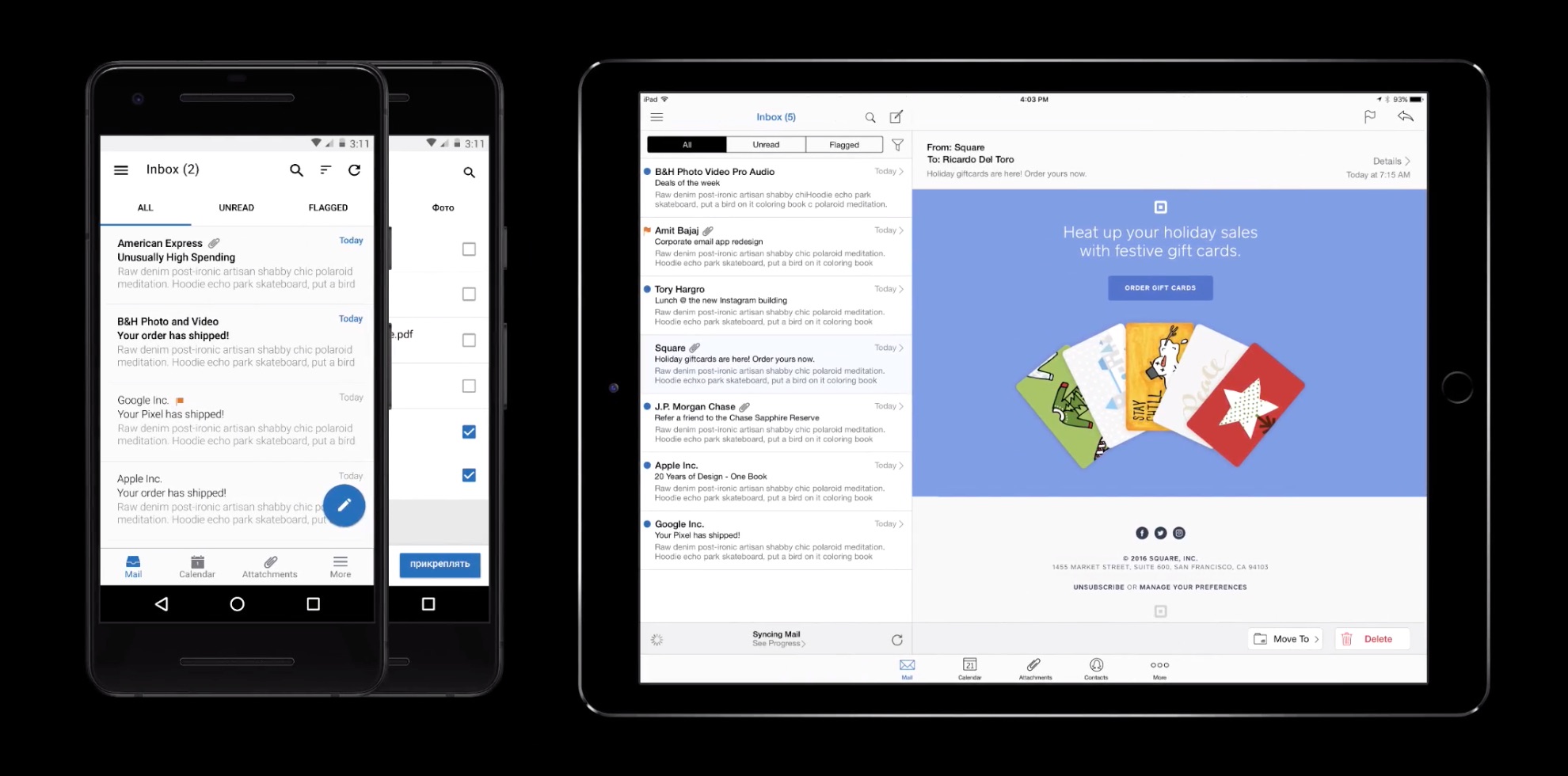
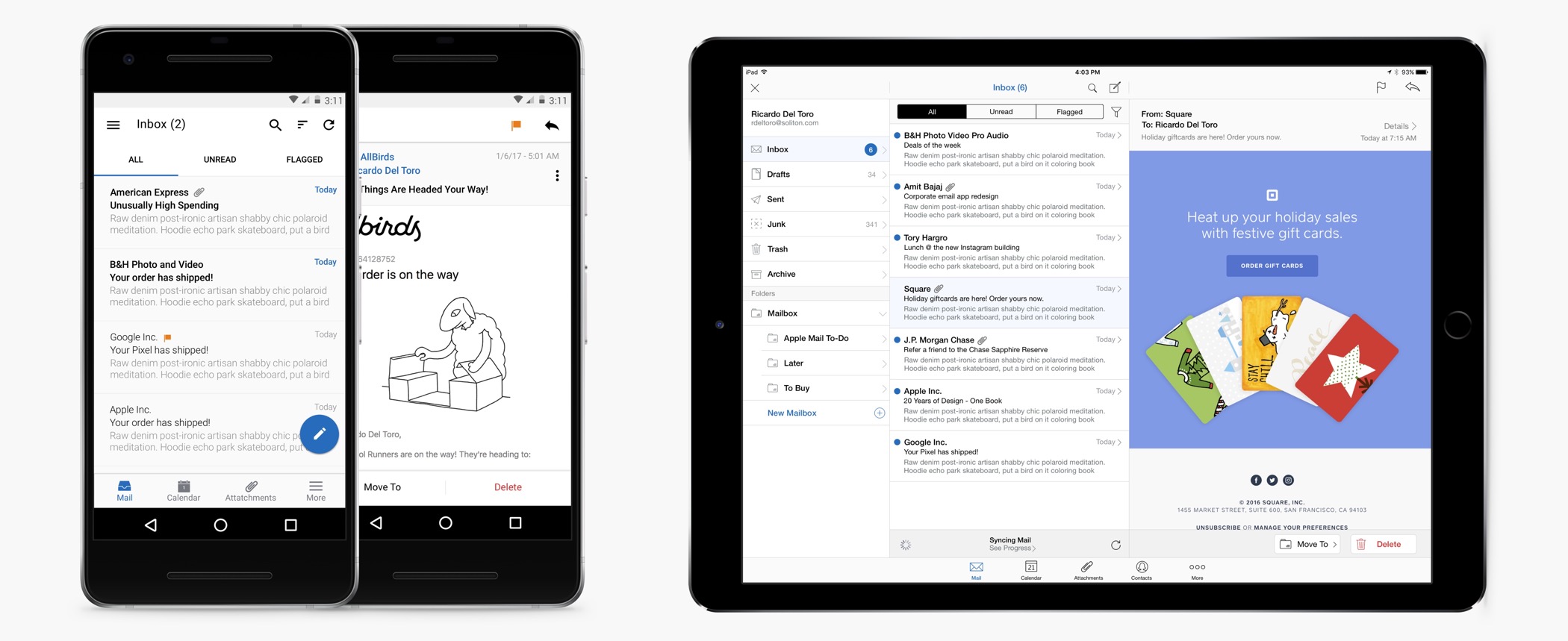
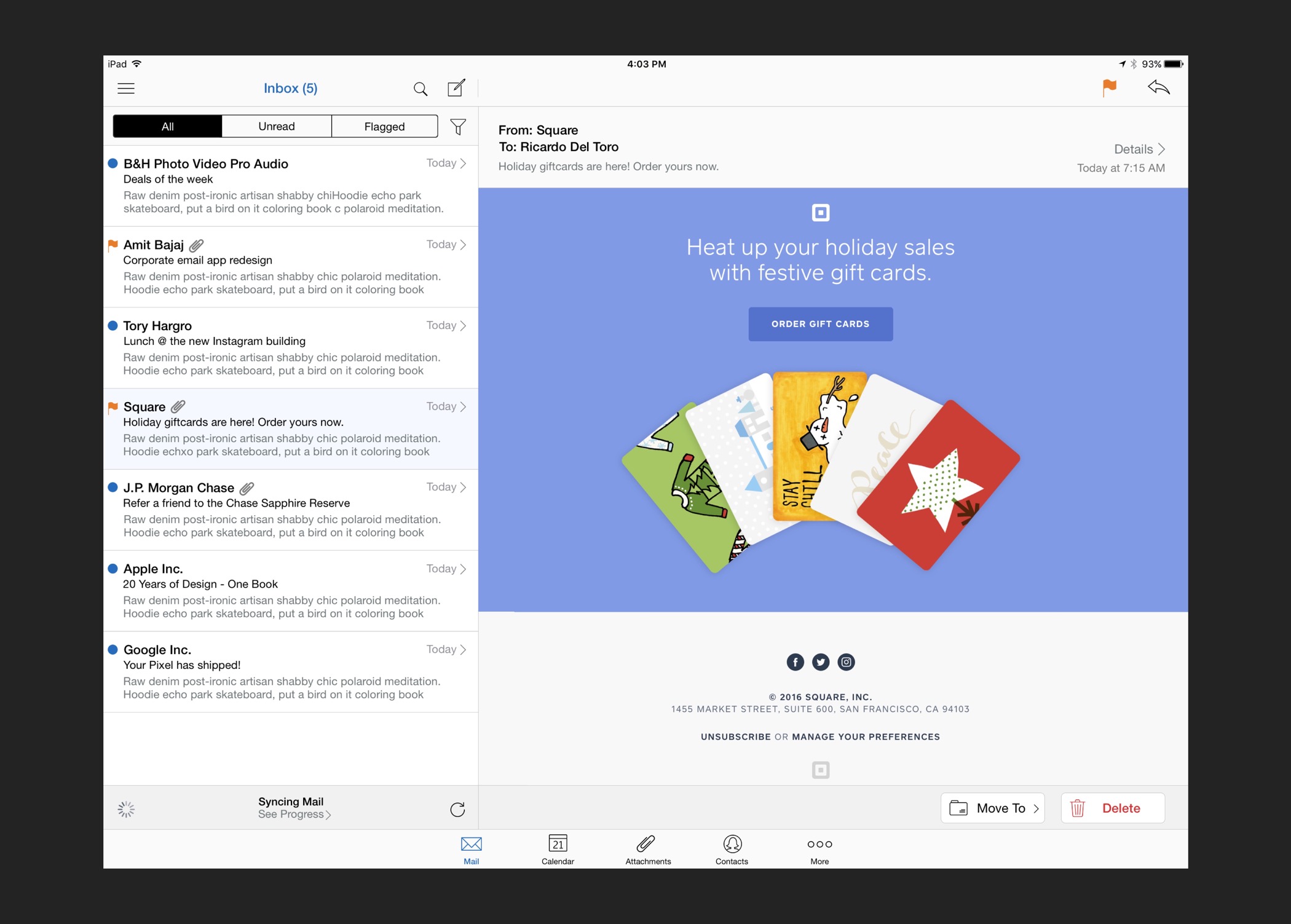
Designing Mail for iOS and Android — How the use of design conventions was critical to staying inside our set of constraints
Goals were straightforward: design a modern and intuitive experience that is able to compete in today’s market within our set of constraints.
Engineering resources were tight and budgets didn’t allow for custom, unfamiliar design patterns and extensive research to support a potentially inferior solution.
Why the use of design conventions fit our needs — and how it helped the team stay inside our set of limitations
Management, the team and my self included wanted an experience that is familiar to users in accordance with the platform they’re using. Relying on established patterns reduces any ambiguity the user might have about how a particular feature works.
The team was mostly constrained by engineering resources and timelines. There wasn’t enough time to test and validate foreign and unfamiliar design patterns.
What failed and why — How a slight diversion from design conventions introduced unnecessary complexity
One approach in communicating email states is to use a blue and orange rectangle at the edge of the screen. My reasoning behind this approach involved the pattern of colors used throughout many email apps to communicate this information.
However, internal feedback yielded exactly the opposite result. The diversion from conventional forms of communication failed in this instance. A rectangle by the edge of the display was simply not clear to users what it meant and it would be a usability problem for users that have visual impairments.
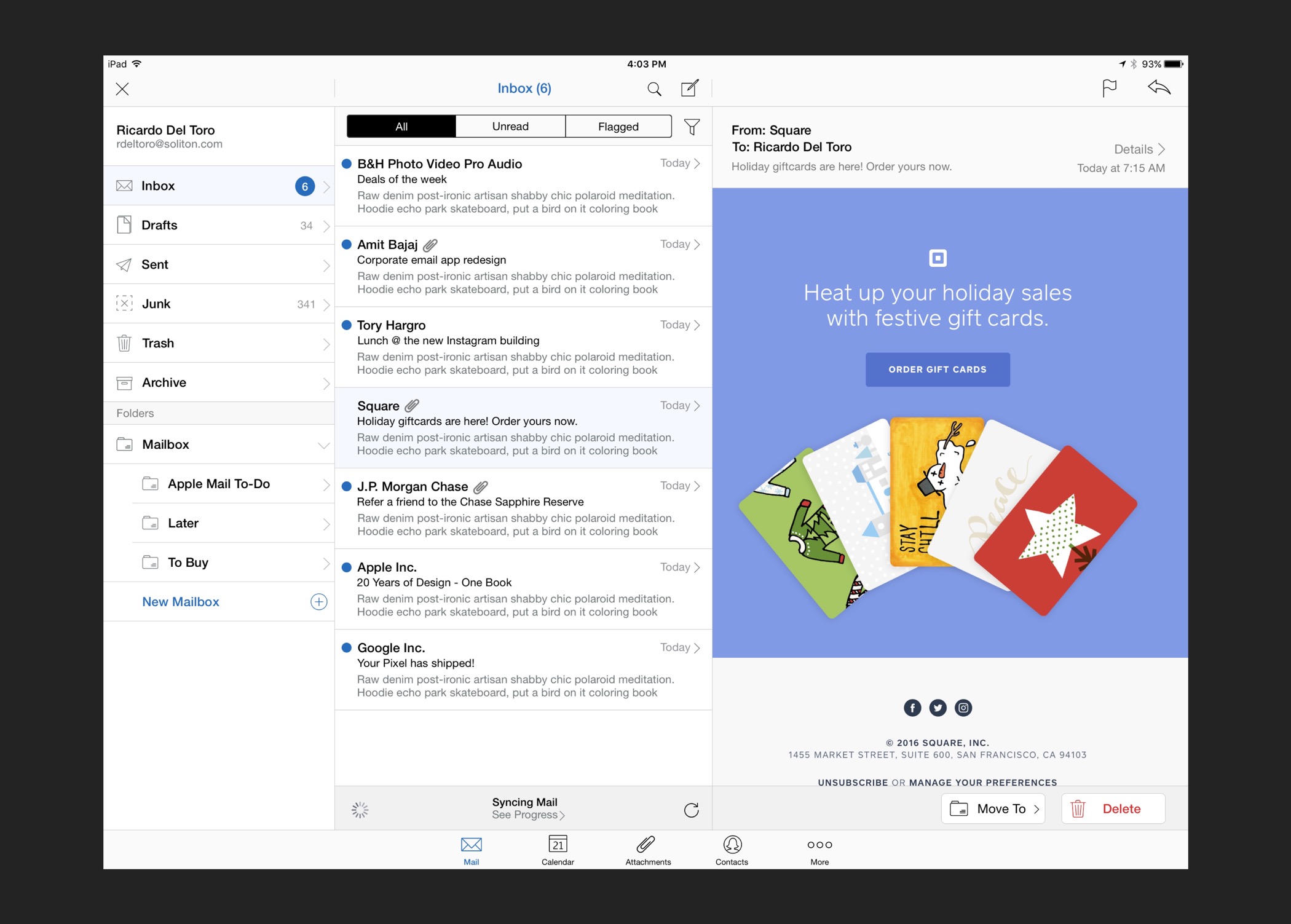
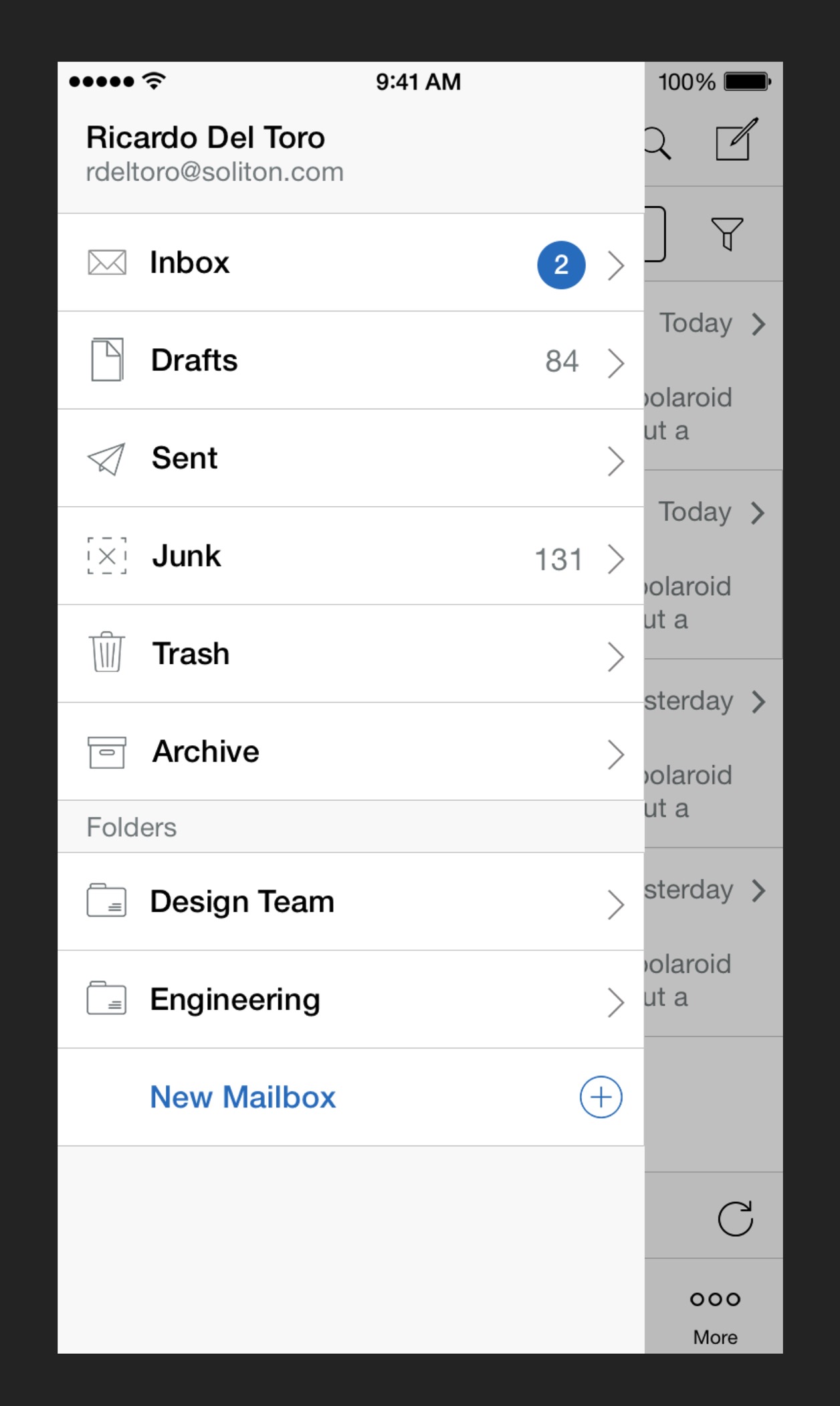
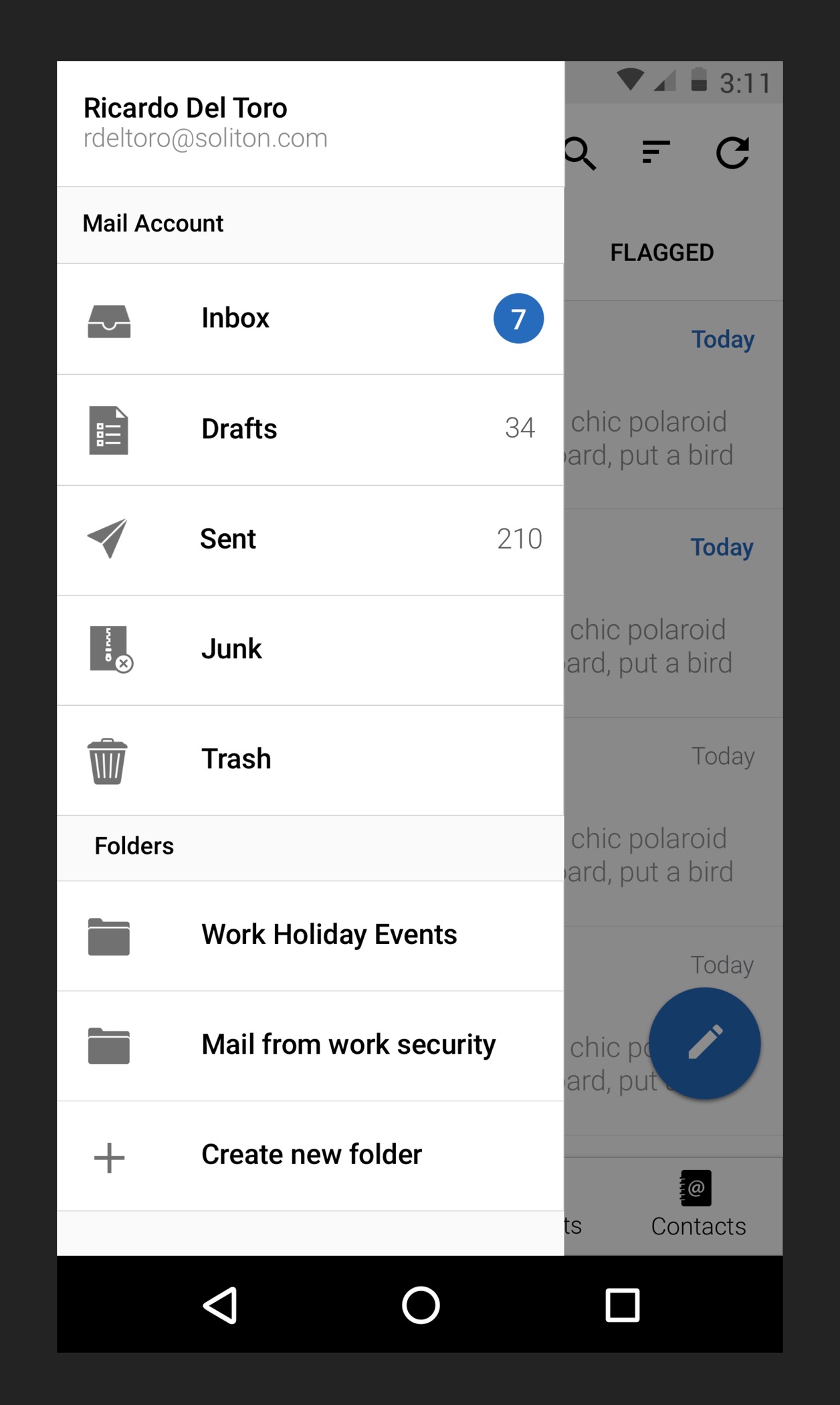
How requirements and constraints mandated the use of a side menu — The use of Dynamic Type and a large list of active folders contributed to this solution
Allowing extensive functionality like accessing folders and creating new folders was easier through a side menu. This applies to both user experience and engineering resources. The side menu is a recognizable pattern and it scales well for system wide functionality like Dynamic Type.
What failed and why — Why context is important in setting expectations
The sketch I list below is one of the many explorations that failed. It largely failed because it was really slow to browse. An expanding menu from the navigation bar that allowed access to their mailboxes was a poor solution to the complex problem that is an email account with active folders.
Providing access to app settings through the side menu was not a great idea. This is why it’s a bad implementation: when a user sees the side menu, the context in that view relates to their email. From their sent mailbox to custom folders. Tapping the settings icon with the available context, users would expect to see settings for their email, based on the available context. The settings icon instead presented settings for the app and not their email. This was a confusing experience, to say the least.
The importance of ergonomics — and how constraints influenced the solution
Explanation regarding the placement of Move To and Delete near the bottom, as opposed to having all four options at the bottom.
The short explanation: performance for icons communicating features like Move To perform rather poorly and a combination of text and icons doesn’t work because of the diversity of screen sizes and localization needs.
Ergonomics and compromise — Why the tool bar is limited to two options and why move to and delete are in the tool bar.
Ideally, all important actions would be at the bottom where it’s easier to access them.
One option is to just rely on icons to communicate important functions. Icons for features like move to are really vague and confusing. We tested a few icons for this feature and the response was not promising. Icons to communicate functionality routinely perform poorly. Nielson Group conducted a study on a university website and relying on iconography to communicate vital information yielded no interaction. Breaking Web Design Conventions = Breaking the User Experience.
A combination of text and icons is another possibility but not a very practical one. Not everybody carries a Google Pixel and even if they did, increasing the font-size at a system level or translating to another language breaks the interface. There’s simply not enough room to fit every option.
Prioritization was crucial in designing the best solution. Icons for reply or flag are really common and are almost identical throughout many apps. People understand these icons well. Placing these icons in the navigation bar without text made sense and in our test group, people interpreted these icons and their value well.
Using icons to communicate something as complex as moving an email to another folder is much harder to do well with an icon and equally difficult for people to interpret them accurately. Our approach is to use an effective and proven solution to clearly communicate value and that is achieved through the use of text. Text is effective in removing any ambiguity the user might have. Here is a really informative article on the usability of icons by Nielsen Group: Icon Usability.
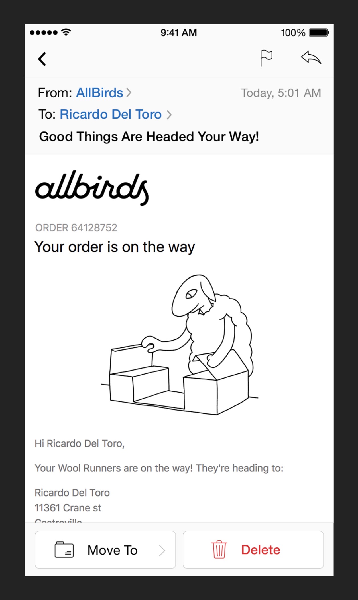
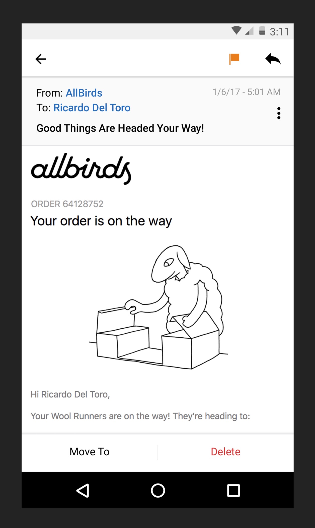
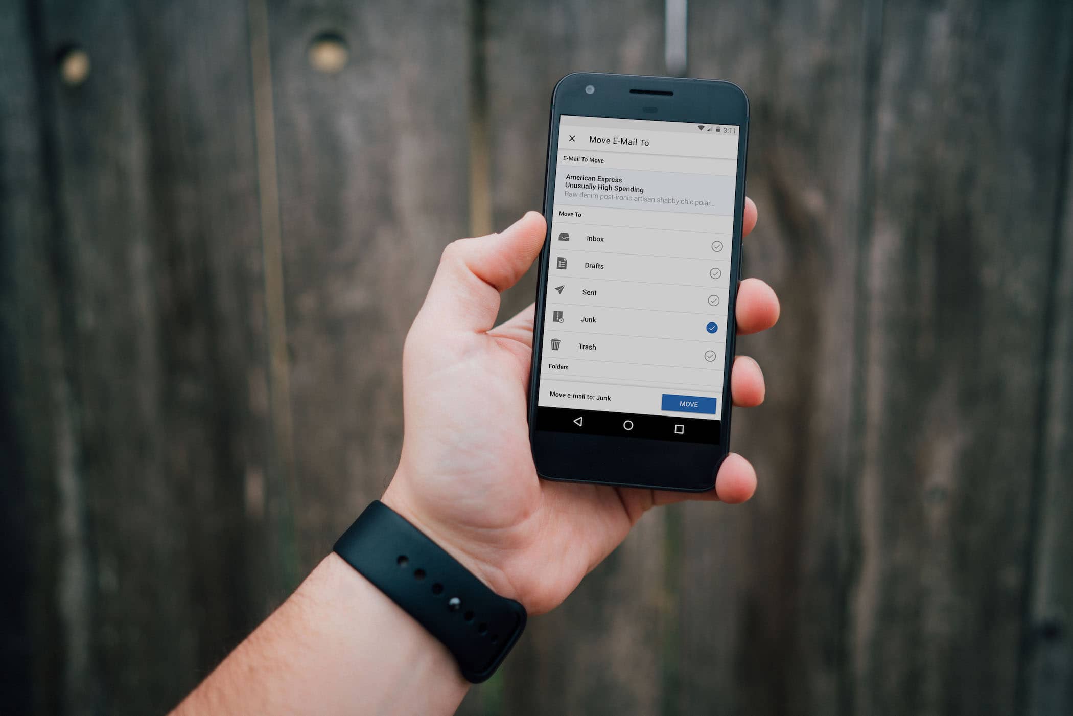
Moving emails — Using color, hiearchy and affordances to create something that is simple and obvious.
The process in designing an experience that allows users to easily move email between mailboxes.
The short explanation: How the user of color, hierarchy and affordances in our interface allowed for an interface that is simple and obvious.
Interface affordance, color and hierarchy
A UI element that is used throughout the app is a tool bar that provides instruction, affordance and a feedback mechanism. I use this element to provide instruction to users when they first open this view. This tool bar serves as a feedback mechanism, too. If a user taps Junk as the destination, the tool bar will update to reflect those changes. An example of how it communicates this information: “Move email to: Junk”. As the tool bar provides feedback, it also displays a clear affordance to move the email and accomplish the task.
Ergonomics in email and necessary trade-offs
Core functionality that sells this product should be easy and clear to identify in the UI. Implementing this functionality above the keyboard makes sense because it’s at a level where it’s physically comfortable to interact with, regardless of the screen size.
No solution is perfect and there were trade-offs. On Android, the attachments and priority buttons are placed near the top. It’s a common pattern in the platform and performed well internally.
The reasoning behind breaking away from how iOS handles this problem has to do with the set of constraints Android introduces: custom keyboards with different heights, a diverse set of screen resolutions and a diverse set of operating systems that may introduce complexity for an already constrained engineering team. It was better to use a recognizable pattern for Android and place these features in the navigation bar.
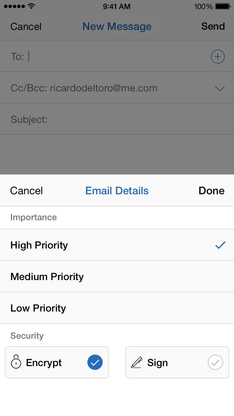
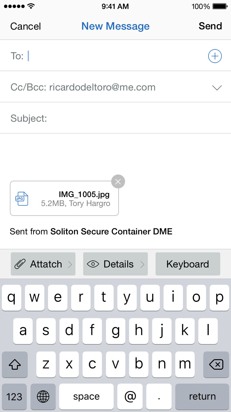
Securing emails — and why the use of hierarchy and context facilitates the process
Providing context to users and informing them of what they are about to encrypt is critical. The more effective way to do so is to allow visual access to the email they’re about to encrypt by way of a modal view.
The use of hierarchy — and how it's used to provide context
Email Details is a big feature in DME and an important feature for the business. Email Details is where customers encrypt their emails and set priority details.
The reasoning behind the modal view not taking over the screen is to allow visual access to the previous view. When users access Email Details and they decide to encrypt an email, they can see exactly what they’re encrypting or prioritizing.
This solution brought into question the consumption of resources and timeline constraints. It was clear that this can be achieved by using UIPresentationController on iOS.
The influence of localization requirements — and how cultural interpretations guide the use of color
Localization requirements influenced the interface throughout the app and specifically how our toolbar was influenced by different language systems and cultural interpretations of color.
The use of design signifiers — and the influence of localization requirements
I’d like to focus on the toolbar specifically and explain how localization requirements influenced it.
Call-to-action buttons are blue accross iOS and Android and that is because DME is a product that crosses borders where different cultures interpret colors in different ways.
The height of the toolbar and the button it self is designed to adapt to tall-writing language systems, larger font-sizes to accommodate languages that rely heavily on digraphs and to simply adapt to larger font-sizes at a system level.
Concluding Thoughts
Designing DME 5.0 was fun and challenging in many levels, including designing for Android, a platform I hadn’t previously designed for or even used. Designing a product so many people use is rewarding and intellectually stimulating. Having to understand how customers use this product was difficult. It went beyond localization, cultural interpretations and accessibility. It also entailed having an understanding of how the corporate world functions and their expectations. Corporate culture, specially the customer base of this product is really conservative and that, like many other variables influenced the design process. Having the opportunity to work with a great team in Denmark and Japan was a privilege. Proud of what we have all accomplished.
Special thanks to my team in 🇩🇰 and 🇯🇵
Jan Johnsen — Product Manager
Ricardo Del Toro — Product Designer
Emil Mourier — Product Designer
Yang Li — iOS Engineer
Morison Yoshinobu — Android Engineer
Next Project
Dewey for iOS
Dewey is a life automation platform. From chores to scheduling to any other monotonous task, the platform will manage your life so you can focus on what necessitates your brain power. Worry less about laundry or what social event you’ll be attending. Instead, invest your energy in tackling challenging issues that only a human can solve.